Chapter 11 Simple linear Regression
In this chapter, let’s continue with another common data modelling technique: linear regression. The premise of data modeling is to make explicit the relationship between:
- an outcome variable \(y\), also called a dependent variable or response variable, and
- an explanatory/predictor variable \(x\), also called an independent variable or covariate.
Another way to state this is using mathematical terminology:
we will model the outcome variable \(y\) “as a function”
of the explanatory/predictor variable \(x\).
When we say “function” here,
we are not referring to functions in R such as the ggplot() function,
but rather as a mathematical function.
Why do we have two different labels, explanatory and predictor, for the variable \(x\)? That’s because even though the two terms are often used interchangeably, roughly speaking data modeling serves one of two purposes:
- Modeling for explanation: When you want to explicitly describe and quantify the relationship between the outcome variable \(y\) and a set of explanatory variables \(x\), determine the significance of any relationships, have measures summarizing these relationships, and possibly identify any causal relationships between the variables.
- Modeling for prediction: When you want to predict an outcome variable \(y\) based on the information contained in a set of predictor variables \(x\). Unlike modeling for explanation, however, you don’t care so much about understanding how all the variables relate and interact with one another, but rather only whether you can make good predictions about \(y\) using the information in \(x\).
For example, say you are interested in an outcome variable \(y\) of whether patients develop lung cancer and information \(x\) on their risk factors, such as smoking habits, age, and socioeconomic status. If we are modeling for explanation, we would be interested in both describing and quantifying the effects of the different risk factors. One reason could be that you want to design an intervention to reduce lung cancer incidence in a population, such as targeting smokers of a specific age group with advertising for smoking cessation programs. If we are modeling for prediction, however, we would not care so much about understanding how all the individual risk factors contribute to lung cancer, but rather only whether we can make good predictions of which people will contract lung cancer.
In this course, we will focus on modeling for explanation and hence refer to \(x\) as explanatory variables. If you are interested in learning about modeling for prediction, we suggest you check out books and courses on the field of machine learning such as An Introduction to Statistical Learning with Applications in R (ISLR) (James et al. 2017).
In this chapter, we will focus on one particular technique: linear regression. Linear regression is one of the most commonly-used and easy-to-understand approaches to modeling. Linear regression involves a numerical outcome variable \(y\) and explanatory variables \(x\) that are either numerical or categorical. Furthermore, the relationship between \(y\) and \(x\) is assumed to be linear, or in other words, a line.
In the current Chapter on basic regression, we will only consider models with one numerical explanatory variable \(x\) This scenario is known as simple linear regression.
In Chapter 12 on inference for regression, we will revisit the regression models we discussed in this chapter and analyze the results using the tools for statistical inference you have developed in Chapters 5, 6, and 7 on sampling, confidence intervals, and hypothesis testing, respectively.
In Chapter 13 on regression with one categorical explanatory variable, we will connect what you have learned from Chapter 10 — ANOVA — with the linear regression technique, and show that they are more similar than you may have previously thought.
Let’s now begin with basic regression, which refers to linear regression models with a continuous explanatory variable \(x\). We will also discuss important statistical concepts such as the correlation coefficient, that “correlation is not necessarily causation,” and what it means for a line to be “best-fitting.”
Needed packages
Let’s get ready all the packages we will need for this chapter.
# Install xfun so that I can use xfun::pkg_load2
if (!requireNamespace('xfun')) install.packages('xfun')
xf <- loadNamespace('xfun')

cran_packages <- c(
                  "broom", # a new package we will introduce in this chapter
                  "dplyr",
                  "gapminder",
                  "ggplot2",
                  "janitor", # a new package we will introduce in this chapter
                  "moderndive",
                  "skimr"
)

if (length(cran_packages) != 0) xf$pkg_load2(cran_packages)

gg <- import::from(ggplot2, .all=TRUE, .into={new.env()})
dp <- import::from(dplyr, .all=TRUE, .into={new.env()})

import::from(magrittr, "%>%")
Recall one of the examples we saw in chapter 2, in which Hans Rosling discussed global economy, health, and development. Let’s use a slice of the same dataset, and try to replicate his analyses partially. Specifically, we will try to explain differences in average life expectancy of a country as a function of one numerical variable: average income of that country. Could it be that countries with higher average income also have higher average life expectancy? Could it be that countries with higher average income tend to have lower average life expectancy? Or could it be that there is no monotonic relationship between average income and average life expectancy? We will answer these questions by modeling the relationship between income and life expectancy using simple linear regression where we have:
- A numerical outcome variable \(y\) (the average life expectancy) and
- A single numerical explanatory variable \(x\) (a country’s average income).
11.1 Exploring the data
The data on the 142 countries
can be found in the gapminder data frame from the gapminder package.
To keep things simple, let’s filter() only the 2007 data
and save this data in a new data frame called df_gapminder2007.
df_gapminder2007 <- gapminder::gapminder %>%
  dp$filter(year == 2007) %>%
  dp$select(-year) %>%
  dp$rename(
            life_exp = lifeExp,
            gdp_per_cap = gdpPercap
            ) %>%
dp$mutate(income = log10(gdp_per_cap)*10000)Rows: 142
Columns: 6
$ country <fct> Afghanistan, Albania, Algeria, Angola, Argentina, Austral…
$ continent <fct> Asia, Europe, Africa, Africa, Americas, Oceania, Europe, …
$ life_exp <dbl> 43.828, 76.423, 72.301, 42.731, 75.320, 81.235, 79.829, 7…
$ pop <int> 31889923, 3600523, 33333216, 12420476, 40301927, 20434176…
$ gdp_per_cap <dbl> 974.5803, 5937.0295, 6223.3675, 4797.2313, 12779.3796, 34…
$ income <dbl> 29888.18, 37735.69, 37940.25, 36809.91, 41065.10, 45370.0…Observe that Observations: 142 indicates that
there are 142 rows/observations in df_gapminder2007,
where each row corresponds to one observed country.
A full documentation of the dataset gapminder, including its background,
can be found at gapminder.org.
A full description of all the variables included in gapminder
can be found in its associated help file
(run ?gapminder::gapminder in the console).
Here is a brief description of 6 variables
we selected in df_gapminder2007:
country: Name of country.
continent: Which of the five continents the country is part of. Note that “Americas” includes countries in both North and South America and that Antarctica is excluded.
life_exp: Life expectancy in years.
pop: Population, number of people living in the country.
gdp_per_cap: Gross domestic product (GDP, in US dollars).
income: log-transformed
gdp_per_cap, a proxy for average income
Good to know
Types of data
In Section 2.10.1, we have compared two common types of data —
continuous and categorical.
Related to this dichotomy, data can also be grouped into four types, namely
nominal, ordinal, interval, and ratio.
For example, country and continent in df_gapminder2007
are considered nominal.
There is no intrinsic order among countries,
nor is it sensible to measure distances (intervals) between the names of two countries.
Ordinal data, as the name suggests, refer to data that can be ordered,
such as low, medium, and high.
However, they should not be confused with interval data,
such as temperature,
which not only can be ordered (e.g., -2°C, -1°C, 0°C, 1°C, …),
but also allows for contant intervals between any adjacent numbers
(e.g., 5°C - 4°C = 8°C - 7°C).
With ordinal data, such as restaurant ratings,
it is not necessarily true that the difference between a one-star rated
and a two-star rated restaurant is equal to
that between a two-star rated and a three-star rated.
Finally, ratio data allow for not only ranking and constant intervals,
but also an absolute zero point.
Examples of ratio data include height, age, population size, and income.
This classification was initally developed by Stanley Smith Stevens and published in a 1946 Science article. It is one of the most widely adopted typologies in psychology, despite criticism from scholars from within psychology and other disciplines. For example, it has long been debated whether behavioural and cognitive data collected using Likert-type scales are ordinal or could be considered as interval. Team Likert Data Are Ordinal argues that the difference between “strongly disagree” (1) and “disagree” (2) is not always equal to that between “disagree” (2) and “indifferent” (3), similar to restaurant ratings. Meanwhile, Team Likert Data Could Be Used As Interval contends that classifying these data as ordinal would rule out many powerful statistical models including ANOVA and \(t\)-test, all of which assume that the dependent variable is interval or ratio data.
An alternative way to look at the raw data values
is by choosing a random sample of the rows in df_gapminder2007.
We can do so
by piping df_gapminder2007 into the dplyr::sample_n() function.
Here we set the size argument to be 5,
indicating that we want a random sample of 5 rows.
We display the results in Table 11.1.
Note that due to the random nature of the sampling,
you will likely end up with a different subset of 5 rows.
| country | continent | life_exp | pop | gdp_per_cap | income |
|---|---|---|---|---|---|
| Togo | Africa | 58.420 | 5701579 | 882.970 | 29459.46 |
| Sao Tome and Principe | Africa | 65.528 | 199579 | 1598.435 | 32036.95 |
| Congo, Dem. Rep. | Africa | 46.462 | 64606759 | 277.552 | 24433.44 |
| Lesotho | Africa | 42.592 | 2012649 | 1569.331 | 31957.15 |
| Bulgaria | Europe | 73.005 | 7322858 | 10680.793 | 40286.04 |
11.1.1 Summary statistics — univariate
Now that we’ve looked at the raw values in our df_gapminder2007 data frame
and got a preliminary sense of the data,
let’s compute summary statistics for the two target varaibles —
a country’s average life expectancy life_exp
and its average income.
We could use dplyr::summarize()
along with summary functions such as mean() and median()
we saw in Section 3.4.
Instead, let’s create a customized function using skimr::skim_with().
This function would take in a data frame,
“skims” it, and returns commonly used summary statistics.
# Create a template function for descriptives
my_skim <- skimr::skim_with(base = skimr::sfl(n = length, missing = skimr::n_missing),
                     numeric = skimr::sfl(
                                          mean,
                                          sd,
                                          iqr = IQR,
                                          min,
                                          p25 = ~ quantile(., 1/4),
                                          median,
                                          p75 = ~ quantile(., 3/4),
                                          max
                                          ),
                            append = FALSE
) #sfl stands for "skimr function list"
Let’s take our df_gapminder2007 data frame,
select() only the outcome and explanatory variables
life_exp and income, and pipe them into the my_skim() function:
| skim_variable | n | missing | mean | sd | iqr | min | p25 | median | p75 | max |
|---|---|---|---|---|---|---|---|---|---|---|
| life_exp | 142 | 0 | 67 | 12 | 19 | 40 | 57 | 72 | 76 | 83 |
| income | 142 | 0 | 37418 | 5889 | 10448 | 24433 | 32106 | 37870 | 42555 | 46934 |
For the numerical variables life_exp and income it returns:
n: the number of observations for each variablemissing: the number of missing values for each variablemean: the averagesd: the standard deviationiqr: the inter-quartile range, or the difference between the \(3^{rd}\) and the \(1^{st}\) quartile.min: the minimum value, also known as the \(0^{th}\) percentile, as in the value at which 0% of observations are smaller than itp25: the \(25^{th}\) percentile, the value at which 25% of observations are smaller than it, also known as the \(1^{st}\) quartile.median: also known as the \(2^nd\) quartile, or the \(50^{th}\) percentile, the value at which 50% of observations are smaller than itp75: the \(75^{th}\) percentile, the value at which 75% of observations are smaller than it, also known as the \(3^{rd}\) quartile.max: the maximum value, also known as the \(100^{th}\) percentile, the value at which 100% of observations are smaller than it.
Looking at Table 11.2, we can see how the values of both variables distribute. For example, the mean life expectancy was 67 years, whereas the mean income was $37,418.
To understand the percentiles, let’s put them in the context.
gg$ggplot(df_gapminder2007,
          mapping = gg$aes(x = "", y = life_exp)) +
  # `x = ""` is necessary when there is only one vector to plot
  gg$geom_boxplot(outlier.colour = "hotpink") +
  # add the mean to the boxplot
  gg$stat_summary(fun=mean, geom="point", shape=5, size=4) +
    gg$geom_jitter(width = 0.1, height = 0, alpha = 0.2) +
  # remove x axis title
  gg$theme(axis.title.x = gg$element_blank())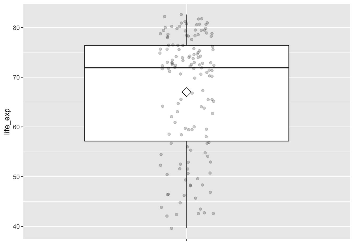
gg$ggplot(df_gapminder2007,
          mapping = gg$aes(x = "", y = income)) +
  # `x = ""` is necessary when there is only one vector to plot
  gg$geom_boxplot(outlier.colour = "hotpink") +
  # add the mean to the boxplot
  gg$stat_summary(fun=mean, geom="point", shape=5, size=4) +
    gg$geom_jitter(width = 0.1, height = 0, alpha = 0.2) +
  # remove x axis title
  gg$theme(axis.title.x = gg$element_blank())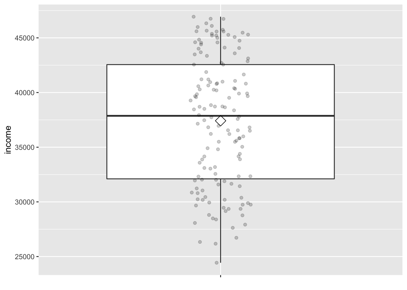
The middle 50% of life expectancy was between 57 to 76 years
(the first quartile, p25, and third quartiles, p75),
whereas the middle 50% of income falls within $32,106 to $42,555.
11.1.2 Summary statistics — bivariate
Since both the life_exp and income variables are numerical,
we can also apply a scatterplot to visualize this data.
Let’s do this using geom_point()
and display the result in Figure 11.1.
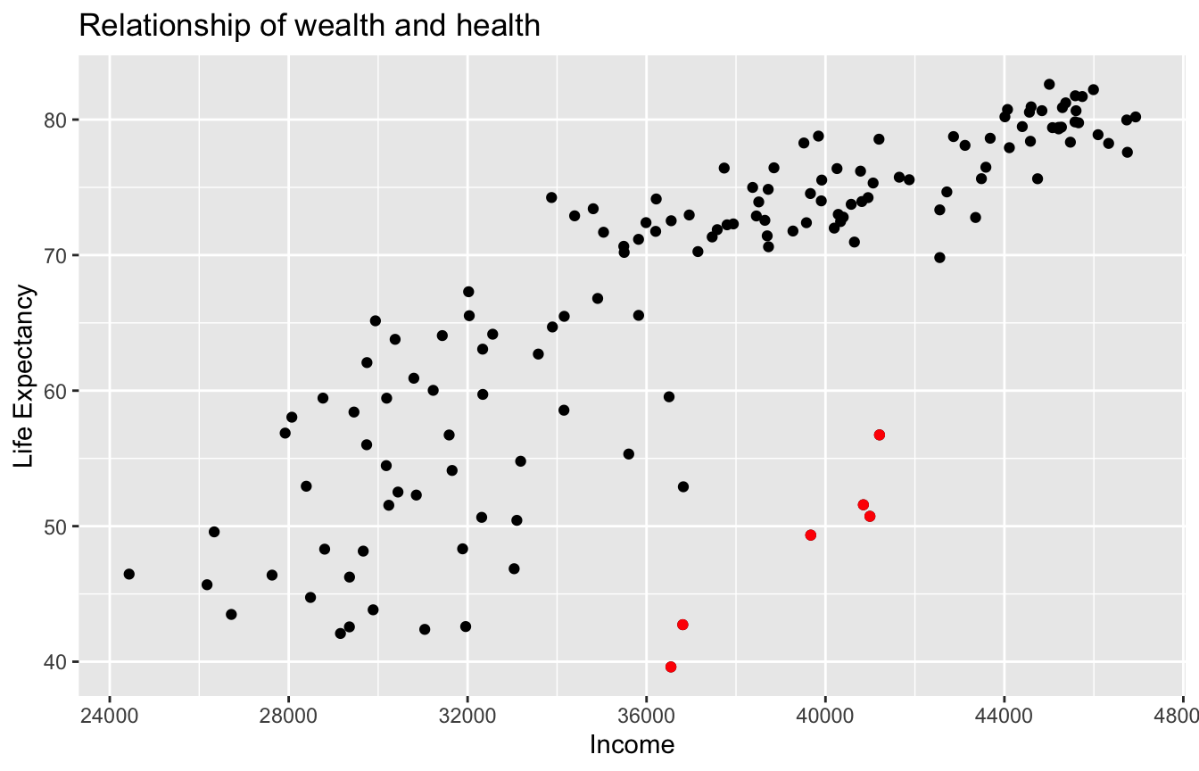
Figure 11.1: Life Expectancy and Average Income
As the average income level increases, life expectancy also tends to go up. However, instead of tightly hugging the imaginary diagonal that goes from bottom left to upper right, as should be in a strictly linear relationship, some of the dots deviated, such as the ones highlighted in red in figure 11.1.
Good to know
Logrithmic
Run the following code chunk and compare the results to Figure 11.1:
# Code not run. Try on your own.
gg$ggplot(df_gapminder2007,
          mapping = gg$aes(y = life_exp, x = gdp_per_cap)) +
  gg$geom_point() +
  gg$labs(title = "Relationship of wealth and health")

# plot with gdpPercap with log-scaled x axis
gg$ggplot(df_gapminder2007,
            mapping = gg$aes(y = life_exp, x = gdp_per_cap)) +
  gg$ geom_point() +
  gg$scale_x_log10() +
  gg$labs(title = "Relationship of wealth and health")
When two variables are numerical, we can compute the correlation coefficient between them. Generally speaking, coefficients are quantitative expressions of a specific phenomenon. A correlation coefficient is a quantitative expression of the strength of the linear relationship between two numerical variables. Its value ranges between -1 and 1 where:
- -1 indicates a perfect negative relationship: As one variable increases, the value of the other variable tends to go down, following a straight line.
- 0 indicates no relationship: The values of both variables go up/down independently of each other.
- +1 indicates a perfect positive relationship: As the value of one variable goes up, the value of the other variable tends to go up as well in a linear fashion.
[.1, .3]: weak[.3, .5]: moderate[.5, 1): strong
Figure 11.2 gives examples of 9 different correlation coefficient values for hypothetical numerical variables \(x\) and \(y\). For example, observe in the top right plot that for a correlation coefficient of -0.75 there is a negative linear relationship between \(x\) and \(y\), but it is not as strong as the negative linear relationship between \(x\) and \(y\) when the correlation coefficient is -0.9 or -1.
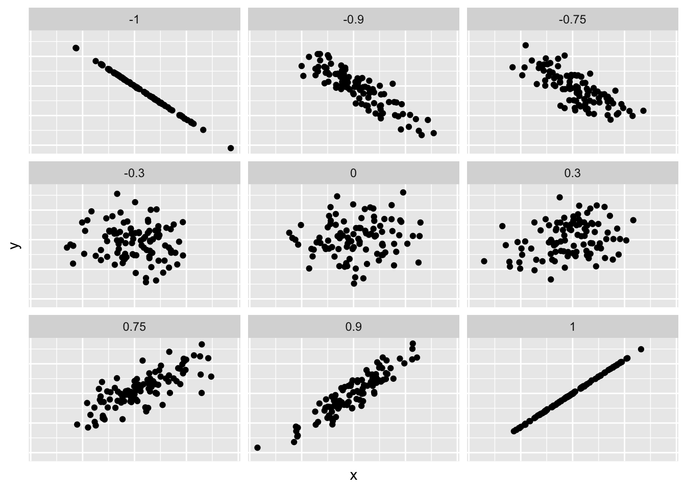
Figure 11.2: Nine different correlation coefficients.
Loosely speaking, the tighter the dots are hugging the imaginary diagonal line, the stronger the relationship between the two variables and hence the larger the magnitude of the correlation coefficient.
Previously, we used my_skim() function to compute what are known as univariate
summary statistics:
functions that take a single variable
and return some numerical summary of that variable.
However, there also exist bivariate summary statistics:
functions that take in two variables
and return some summary of those two variables;
such as a correlation coefficient.
The correlation coefficient can be computed using the get_correlation()
function in the moderndive package.
In this case, the inputs to the function are the two numerical variables
for which we want to calculate the correlation coefficient.
We put the name of the outcome variable on the left-hand side
of the ~ “tilde” sign,
while putting the name of the explanatory variable on the right-hand side.
This is known as R’s formula notation.
We will use this same “formula” syntax with regression later in this chapter.
# A tibble: 1 x 1
    cor
  <dbl>
1 0.809
An alternative way to compute correlation
is to use the cor() summary function from base R
in conjunction with a dplyr::summarize():
In our case, the correlation coefficient of 0.809 indicates that the relationship between life expectancy and income is “strongly positive.” There is a certain amount of subjectivity in interpreting correlation coefficients, especially those that aren’t close to the extreme values of -1, 0, and 1. To develop your intuition about correlation coefficients, play the “Guess the Correlation” 1980’s style video game mentioned in Subsection 11.6.1.
11.2 Model fitting
Let’s build on the scatterplot in Figure 11.1
by adding a “best-fitting” line:
of all possible lines we can draw on this scatterplot,
it is the line that “best” fits through the cloud of points.
We will explain what criterion dictates which line fits the best
in Section 11.3.
For now, let’s request this line
by adding a new geom_smooth(method = "lm", se = FALSE) layer
to the ggplot() code that created the scatterplot
in Figure 11.1.
The method = "lm" argument sets the line to be a “linear model.”
The se = FALSE argument
suppresses standard error uncertainty bars.
We have seen the concept of standard error of mean
in Section 5.2.1.
We will extend this concept to regression coefficients
in Chapter 12.
gg$ggplot(df_gapminder2007,
          mapping = gg$aes(x = income, y = life_exp)) +
  gg$geom_point() +
  gg$labs(x = "Income", y = "Life Expectancy",
       title = "Average Income and Life Expectancy") +
  gg$geom_smooth(method = "lm", se = FALSE)
Figure 11.3: Regression line.
The line in the resulting Figure 11.3
is called a “regression line.”
The regression line is a visual summary
of the relationship between two numerical variables,
in our case the outcome variable life_exp
and the explanatory variable income.
The positive slope of the blue line is consistent
with our earlier observed correlation coefficient of cor_gapminder
suggesting that there is a positive relationship
between these two variables: as the average income of a country increases,
so does the life expectancy in this country.
We will see later that, although the correlation coefficient
and the slope of a regression line typically have the same sign
(positive or negative), they typically do not have the same value.
You may recall from secondary/high school algebra that the equation of a line is \(y = a + b\cdot x\). (Note that the \(\cdot\) symbol is equivalent to the \(\times\) “multiply by” mathematical symbol.) It is defined by two coefficients \(a\) and \(b\). The intercept coefficient \(a\) is the value of \(y\) when \(x = 0\). The slope coefficient \(b\) for \(x\) is the increase in \(y\) for every increase of one in \(x\). This is also called the “rise over run.”
However, when defining a regression line like the regression line in Figure 11.3, we use slightly different notation: the equation of the regression line is \(\widehat{y} = b_0 + b_1 \cdot x\) . The intercept coefficient is \(b_0\), so \(b_0\) is the value of \(\widehat{y}\) when \(x = 0\). The slope coefficient for \(x\) is \(b_1\), i.e., the increase in \(\widehat{y}\) for every increase of one in \(x\). Why do we put a “hat” on top of the \(y\)? It’s a form of notation commonly used in regression to indicate that we have a “fitted value,” or the value of \(y\) on the regression line for a given \(x\) value. We will discuss this more in the upcoming Subsection 11.3.
We know that the regression line in Figure 11.3
has a positive slope \(b_1\) corresponding
to our explanatory \(x\) variable income.
Why? Because as countries tend to have higher average income,
so also do they tend to have higher life_exp, or life expectancy.
What is the numerical value of the slope \(b_1\) and the intercept \(b_0\)?
Let’s not compute these two values by hand,
but rather let’s use a computer!
We can obtain the values of the intercept \(b_0\)
and the slope for income \(b_1\)
by outputting a linear regression table. This is done in two steps:
- We first “fit” the linear regression model using the
lm()function and save it inhealth_model. - We get the regression table by applying the
get_regression_table()function from themoderndivepackage tohealth_model.
# Fit regression model:
health_model <- lm(life_exp ~ income, data = df_gapminder2007)
# Get regression table:
moderndive::get_regression_table(health_model)| term | estimate | std_error | statistic | p_value | lower_ci | upper_ci |
|---|---|---|---|---|---|---|
| intercept | 4.950 | 3.858 | 1.283 | 0.202 | -2.677 | 12.576 |
| income | 0.002 | 0.000 | 16.283 | 0.000 | 0.001 | 0.002 |
Let’s first focus on interpreting the regression table output
in Table 11.3,
and then we will later revisit the code that produced it.
In the estimate column of Table 11.3
are the intercept \(b_0\) = 4.95
and the slope \(b_1\) = 0.002 for income.
Thus the equation of the regression line in Figure 11.3 follows:
\[ \begin{aligned} \widehat{y} &= b_0 + b_1 \cdot x\\ \widehat{\text{life_exp}} &= b_0 + b_{\text{income}} \cdot\text{income}\\ &= 4.95 + 0.002\cdot\text{income} \end{aligned} \]
It is very important to report both the statistics and interpret them in plain English. In this example, it is not enough by just reporting the regression table and the equation of the regression line. As a good researcher, you are also expected to explain what these numbers mean.
The intercept \(b_0\) = 4.95 is the average life expectancy
\(\widehat{y}\) = \(\widehat{\text{life_exp}}\) for those countries
that have an income of 0.
Or in graphical terms,
it’s where the line intersects the \(y\) axis when \(x\) = 0.
Note, however, that while the intercept of the regression line
has a mathematical interpretation,
it has no practical interpretation here,
since it is unlikely that a country will have an average income of 0.
Furthermore, looking at the scatterplot
in Figure 11.3,
no country has an income level anywhere near 0.
The more interesting parameter is the slope
\(b_1\) = \(b\_{\text{income}}\) for income of 0.002,
as this summarizes the relationship between the income levels
and life expectancies.
Note that the sign is positive,
suggesting a positive relationship between these two variables,
meaning countries with higher average income
also tend to have longer life expectancy.
Formally, the slope is interpreted as:
For every increase of 1 unit in
income, there is an associated increase of, on average, 0.002 units oflife expectancy. Or, for every increase of $1,000 inincome, there is an associated 2 years increase inlife expectancy.
Recall from earlier that the correlation coefficient is 0.809.
Both correlation coefficient and the slope have the same positive sign,
but they have different values.
A correlation coefficient quantifies the strength of linear association
between two variables.
It is independent of units used in either variable.
In fact, correlation is one of the standardized effect sizes.
A regression slope, however, is unit-dependent.
Changing the unit of income from $ (US dollar) to € (Euro),
for example, will change the magnitude of the slope.
Although a regression slope is not ideal for comparing results across studies,
its unit-dependency provides a meaningful context
for interpreting results within a single study.
Note the language used in the previous interpretation. We only state that there is an associated increase and not necessarily a causal increase. For example, perhaps it’s not that higher income levels directly cause longer life expectancies per se. Instead, the reverse could hold true: longevity may lead to late retirement, which would contribute to higher income level. In other words, just because two variables are strongly associated, it doesn’t necessarily mean that one causes the other. This is summed up in the often quoted phrase, “correlation is not necessarily causation.” We discuss this idea further in Subsection on 11.5.1.
Furthermore, we say that this associated increase is on average
0.002 units of life expectancy,
because you might have two countries whose income levels
differ by 1000 dollars,
but their difference in life expectancies will not necessarily be exactly
2 years (try for yourself).
What the slope of 0.002 is saying is that
across all contries, the average difference in life expectancy
between two contries whose incomes differ by 1000 dollars
is 2 years.
Now that we have learned how to compute the equation for the regression line
in Figure 11.3 using the values in the estimate column
of Table 11.3,
and how to interpret the resulting intercept and slope,
let’s revisit the code that generated this table:
# Fit regression model:
health_model <- lm(life_exp ~ income, data = df_gapminder2007)
# Get regression table:
moderndive::get_regression_table(health_model)
First, we “fit” the linear regression model to the data
using the lm() function and save this as health_model.
When we say “fit,” we mean “find the best fitting line to this data.”
lm() stands for “linear model” and is used as follows:
lm(y ~ x, data = data_frame_name) where:
yis the outcome variable, followed by a tilde~. In our case,yis set tolife_exp.xis the explanatory variable. In our case,xis set toincome.- The combination of
y ~ xis called a model formula. (Note the order ofyandx.) In our case, the model formula islife_exp ~ income. We saw such model formulas earlier when we computed the correlation coefficient using theget_correlation()function in Subsection 11.1. data_frame_nameis the name of the data frame that contains the variablesyandx. In our case,data_frame_nameis thedf_gapminder2007data frame.
Second, we take the saved model in health_model
and apply the get_regression_table() function from the moderndive package
to it to obtain the regression table in Table 11.3.
This function is an example of what’s known in computer programming
as a wrapper function.
They take other pre-existing functions
and “wrap” them into a single function that hides its inner workings.
This concept is illustrated in Figure 11.4.
Figure 11.4: The concept of a wrapper function.
So all you need to worry about is
what the inputs look like and what the outputs look like;
you leave all the other details “under the hood of the car.”
In our regression modeling example, the get_regression_table() function
takes a saved lm() linear regression model as input
and returns a object of the regression table as output (which is saved
as type data frame).
If you’re interested in learning more
about the get_regression_table() function’s inner workings,
check out Subsection 11.5.2.
Lastly, you might be wondering what the remaining five columns
in Table 11.3 are: std_error, statistic, p_value,
lower_ci and upper_ci.
They are the standard error, test statistic, p-value,
lower 95% confidence interval bound,
and upper 95% confidence interval bound.
They tell us about both the statistical significance
and practical significance of our results.
This is loosely the “meaningfulness” of our results
from a statistical perspective.
Let’s put aside these ideas for now
and revisit them in Chapter
12 on (statistical) inference for regression.
11.3 Finding the best-fitting line
Now that we have seen how to use function moderndive::get_regression_table()
to get the value of the intercept and the slope of a regression line,
let’s tie up some loose ends:
What criterion dictates which line is the the “best-fitting” regression line?
First, we need to introduce a few important concepts
through the following example.
Table 11.4 below is the 67th row from the df_gapminder2007 data frame.
| country | continent | life_exp | income |
|---|---|---|---|
| Japan | Asia | 83 | 45005 |
What would be the value \(\widehat{\text{life_exp}}\) on the regression line
corresponding to Japan’s average income of $45,005?
In Figure 11.5 we zoom in
on the circle, the sqaure, and the arrow for the country Japan:
- Circle: The observed value \(y\) = 82.603 is Japan’s actual average life expectancy.
- Square: The fitted value \(\widehat{y}\) is the value on the regression line
for \(x\) =
income= $45,005. This value is computed using the intercept and slope in the previous regression table:
\[\widehat{y} = b_0 + b_1 \cdot x = 4.95 + 0.002 \cdot 45004.57 = 79.59\]
- Arrow: The length of this arrow is the residual
and is computed by subtracting the fitted value \(\widehat{y}\)
from the observed value \(y\).
The residual can be thought of as a model’s error
or “lack of fit” for a particular observation.
In the case of Japan, it is \(y - \widehat{y}\) = 82.603 - 79.59 = 3.013.
Figure 11.5: Example of observed value, fitted value, and residual.
Figure 11.6 displays three more arbitrarily chosen countries in addition to Japan, with each country’s observed \(y\), fitted \(\hat{y}\), and the residual \(y - \hat{y}\) marked.
Figure 11.6: Example of observed value, fitted value, and residual.
Panel A in Figure 11.6 is a replica of Figure 11.5, which highlights the country Japan. The three other plots refer to:
A country with an average income of \(x\) = $36,954 and life expectancy of \(y\) = 72.96. The residual in this case is \(72.96 - 66.24 = 6.72\), which we mark with a new blue arrow in Panel B.
A country with an average income of \(x\) = $38,372 and life expectancy of \(y\) = 74.99. The residual in this case is \(74.99 - 68.59 = 6.4\), which we mark with a new blue arrow in Panel C.
A country with an average income of \(x\) = $31,653 and life expectancy of \(y\) = 54.11. The residual in this case is \(54.11 - 57.45 = -3.34\), which we mark with a new blue arrow in Panel D.
Now say we want to repeat this process
and compute both the fitted value
\(\widehat{y} = b_0 + b_1 \cdot x\)
and the residual \(y - \widehat{y}\) for all 142 countries
in the study.
We could repeat the previous calculations we have performed
by hand 142 times,
but that would be tedious and error prone.
Instead, let’s do this using a computer
with the moderndive::get_regression_points() function.
Just like the get_regression_table() function,
the get_regression_points() function is a “wrapper” function.
However, this function returns a different output.
Let’s apply the get_regression_points() function to health_model,
which is where we saved our lm() model in the previous section.
The results are presented in Table 11.5.
| ID | life_exp | income | life_exp_hat | residual |
|---|---|---|---|---|
| 1 | 43.828 | 29888.18 | 54.519 | -10.691 |
| 2 | 76.423 | 37735.69 | 67.534 | 8.889 |
| 3 | 72.301 | 37940.25 | 67.874 | 4.427 |
| 4 | 42.731 | 36809.91 | 65.999 | -23.268 |
| 5 | 75.320 | 41065.10 | 73.056 | 2.264 |
| 6 | 81.235 | 45370.05 | 80.196 | 1.039 |
| 7 | 79.829 | 45578.26 | 80.541 | -0.712 |
| 8 | 75.635 | 44741.59 | 79.154 | -3.519 |
| 9 | 64.062 | 31434.06 | 57.083 | 6.979 |
| 10 | 79.441 | 45275.35 | 80.039 | -0.598 |
| 11 | 56.728 | 31587.50 | 57.338 | -0.610 |
| 12 | 65.554 | 35823.06 | 64.362 | 1.192 |
| 13 | 74.852 | 38719.40 | 69.166 | 5.686 |
| 14 | 50.728 | 40993.30 | 72.937 | -22.209 |
| 15 | 72.390 | 39574.06 | 70.583 | 1.807 |
| 16 | 73.005 | 40286.04 | 71.764 | 1.241 |
| 17 | 52.295 | 30853.02 | 56.120 | -3.825 |
| 18 | 49.580 | 26335.40 | 48.627 | 0.953 |
| 19 | 59.723 | 32339.55 | 58.585 | 1.138 |
| 20 | 50.430 | 33100.76 | 59.847 | -9.417 |
| 21 | 80.653 | 45601.37 | 80.580 | 0.073 |
| 22 | 44.741 | 28488.15 | 52.197 | -7.456 |
| 23 | 50.651 | 32314.86 | 58.544 | -7.893 |
| 24 | 78.553 | 41196.40 | 73.274 | 5.279 |
| 25 | 72.961 | 36954.04 | 66.238 | 6.723 |
| 26 | 72.889 | 38455.06 | 68.728 | 4.161 |
| 27 | 65.152 | 29939.42 | 54.604 | 10.548 |
| 28 | 46.462 | 24433.44 | 45.473 | 0.989 |
| 29 | 55.322 | 35602.12 | 63.996 | -8.674 |
| 30 | 78.782 | 39843.05 | 71.030 | 7.752 |
| 31 | 48.328 | 31888.58 | 57.837 | -9.509 |
| 32 | 75.748 | 41649.24 | 74.025 | 1.723 |
| 33 | 78.273 | 39517.31 | 70.489 | 7.784 |
| 34 | 76.486 | 43585.69 | 77.237 | -0.751 |
| 35 | 78.332 | 45475.09 | 80.370 | -2.038 |
| 36 | 54.791 | 33185.81 | 59.988 | -5.197 |
| 37 | 72.235 | 37799.84 | 67.641 | 4.594 |
| 38 | 74.994 | 38371.63 | 68.589 | 6.405 |
| 39 | 71.338 | 37467.26 | 67.089 | 4.249 |
| 40 | 71.878 | 37580.30 | 67.277 | 4.601 |
| 41 | 51.579 | 40847.22 | 72.695 | -21.116 |
| 42 | 58.040 | 28071.08 | 51.506 | 6.534 |
| 43 | 52.947 | 28393.56 | 52.041 | 0.906 |
| 44 | 79.313 | 45212.31 | 79.935 | -0.622 |
| 45 | 80.657 | 44838.73 | 79.315 | 1.342 |
| 46 | 56.735 | 41207.87 | 73.293 | -16.558 |
| 47 | 59.448 | 28766.51 | 52.659 | 6.789 |
| 48 | 79.406 | 45074.56 | 79.706 | -0.300 |
| 49 | 60.022 | 31230.70 | 56.746 | 3.276 |
| 50 | 79.483 | 44399.39 | 78.586 | 0.897 |
| 51 | 70.259 | 37148.37 | 66.560 | 3.699 |
| 52 | 56.007 | 29743.52 | 54.279 | 1.728 |
| 53 | 46.388 | 27628.52 | 50.772 | -4.384 |
| 54 | 60.916 | 30797.73 | 56.028 | 4.888 |
| 55 | 70.198 | 35500.24 | 63.827 | 6.371 |
| 56 | 82.208 | 45990.64 | 81.225 | 0.983 |
| 57 | 73.338 | 42554.88 | 75.527 | -2.189 |
| 58 | 81.757 | 45584.78 | 80.552 | 1.205 |
| 59 | 64.698 | 33895.58 | 61.166 | 3.532 |
| 60 | 70.650 | 35490.83 | 63.811 | 6.839 |
| 61 | 70.964 | 40646.72 | 72.362 | -1.398 |
| 62 | 59.545 | 36504.11 | 65.492 | -5.947 |
| 63 | 78.885 | 46093.38 | 81.396 | -2.511 |
| 64 | 80.745 | 44069.36 | 78.039 | 2.706 |
| 65 | 80.546 | 44559.06 | 78.851 | 1.695 |
| 66 | 72.567 | 38645.63 | 69.044 | 3.523 |
| 67 | 82.603 | 45004.57 | 79.590 | 3.013 |
| 68 | 72.535 | 36550.87 | 65.569 | 6.966 |
| 69 | 54.110 | 31653.18 | 57.447 | -3.337 |
| 70 | 67.297 | 32022.34 | 58.059 | 9.238 |
| 71 | 78.623 | 43682.52 | 77.397 | 1.226 |
| 72 | 77.588 | 46749.25 | 82.484 | -4.896 |
| 73 | 71.993 | 40195.76 | 71.615 | 0.378 |
| 74 | 42.592 | 31957.15 | 57.951 | -15.359 |
| 75 | 45.678 | 26175.32 | 48.362 | -2.684 |
| 76 | 73.952 | 40812.57 | 72.638 | 1.314 |
| 77 | 59.443 | 30190.21 | 55.020 | 4.423 |
| 78 | 48.303 | 28804.42 | 52.722 | -4.419 |
| 79 | 74.241 | 40952.27 | 72.869 | 1.372 |
| 80 | 54.467 | 30181.10 | 55.005 | -0.538 |
| 81 | 64.164 | 32560.32 | 58.951 | 5.213 |
| 82 | 72.801 | 40396.91 | 71.948 | 0.853 |
| 83 | 76.195 | 40783.69 | 72.590 | 3.605 |
| 84 | 66.803 | 34907.69 | 62.844 | 3.959 |
| 85 | 74.543 | 39663.25 | 70.731 | 3.812 |
| 86 | 71.164 | 35820.83 | 64.359 | 6.805 |
| 87 | 42.082 | 29157.62 | 53.308 | -11.226 |
| 88 | 62.069 | 29749.72 | 54.290 | 7.779 |
| 89 | 52.906 | 36822.41 | 66.020 | -13.114 |
| 90 | 63.785 | 30379.68 | 55.335 | 8.450 |
| 91 | 79.762 | 45658.23 | 80.674 | -0.912 |
| 92 | 80.204 | 44011.42 | 77.943 | 2.261 |
| 93 | 72.899 | 34392.25 | 61.989 | 10.910 |
| 94 | 56.867 | 27921.65 | 51.258 | 5.609 |
| 95 | 46.859 | 33040.55 | 59.748 | -12.889 |
| 96 | 80.196 | 46933.50 | 82.789 | -2.593 |
| 97 | 75.640 | 43486.20 | 77.072 | -1.432 |
| 98 | 65.483 | 34159.66 | 61.604 | 3.879 |
| 99 | 75.537 | 39916.33 | 71.151 | 4.386 |
| 100 | 71.752 | 36204.32 | 64.995 | 6.757 |
| 101 | 71.421 | 38697.54 | 69.130 | 2.291 |
| 102 | 71.688 | 35038.56 | 63.061 | 8.627 |
| 103 | 75.563 | 41872.36 | 74.395 | 1.168 |
| 104 | 78.098 | 43119.58 | 76.464 | 1.634 |
| 105 | 78.746 | 42862.03 | 76.037 | 2.709 |
| 106 | 76.442 | 38848.02 | 69.379 | 7.063 |
| 107 | 72.476 | 40337.64 | 71.850 | 0.626 |
| 108 | 46.242 | 29360.55 | 53.644 | -7.402 |
| 109 | 65.528 | 32036.95 | 58.083 | 7.445 |
| 110 | 72.777 | 43355.55 | 76.855 | -4.078 |
| 111 | 63.062 | 32336.24 | 58.579 | 4.483 |
| 112 | 74.002 | 39906.29 | 71.134 | 2.868 |
| 113 | 42.568 | 29357.80 | 53.640 | -11.072 |
| 114 | 79.972 | 46734.19 | 82.459 | -2.487 |
| 115 | 74.663 | 42713.38 | 75.790 | -1.127 |
| 116 | 77.926 | 44110.85 | 78.108 | -0.182 |
| 117 | 48.159 | 29666.77 | 54.152 | -5.993 |
| 118 | 49.339 | 39670.64 | 70.744 | -21.405 |
| 119 | 80.941 | 44597.10 | 78.914 | 2.027 |
| 120 | 72.396 | 35988.01 | 64.636 | 7.760 |
| 121 | 58.556 | 34153.73 | 61.594 | -3.038 |
| 122 | 39.613 | 36545.12 | 65.560 | -25.947 |
| 123 | 80.884 | 45296.84 | 80.075 | 0.809 |
| 124 | 81.701 | 45741.06 | 80.811 | 0.890 |
| 125 | 74.143 | 36216.49 | 65.015 | 9.128 |
| 126 | 78.400 | 44581.58 | 78.888 | -0.488 |
| 127 | 52.517 | 30443.37 | 55.440 | -2.923 |
| 128 | 70.616 | 38726.46 | 69.178 | 1.438 |
| 129 | 58.420 | 29459.46 | 53.808 | 4.612 |
| 130 | 69.819 | 42554.78 | 75.527 | -5.708 |
| 131 | 73.923 | 38508.25 | 68.816 | 5.107 |
| 132 | 71.777 | 39272.82 | 70.084 | 1.693 |
| 133 | 51.542 | 30238.20 | 55.100 | -3.558 |
| 134 | 79.425 | 45211.81 | 79.934 | -0.509 |
| 135 | 78.242 | 46329.80 | 81.788 | -3.546 |
| 136 | 76.384 | 40257.75 | 71.717 | 4.667 |
| 137 | 73.747 | 40575.07 | 72.244 | 1.503 |
| 138 | 74.249 | 33876.70 | 61.134 | 13.115 |
| 139 | 73.422 | 34807.76 | 62.678 | 10.744 |
| 140 | 62.698 | 33580.82 | 60.644 | 2.054 |
| 141 | 42.384 | 31042.18 | 56.433 | -14.049 |
| 142 | 43.487 | 26718.29 | 49.262 | -5.775 |
Let’s inspect the individual columns in Table 11.5 and match them with the elements in Figure 11.7:
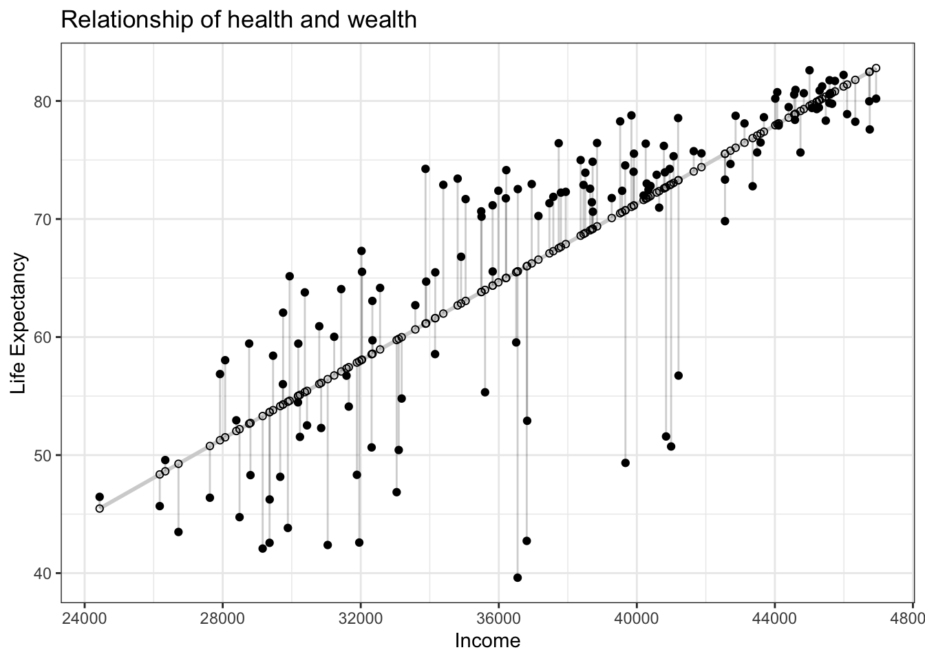
Figure 11.7: Observed, fitted, and residuals of all 142 countries.
- The
life_expcolumn represents the observed outcome variable \(y\). This is the y-position of the 142 solid black dots in Figure 11.7. - The
incomecolumn represents the values of the explanatory variable \(x\). This is the x-position of the 142 solid black dots in Figure 11.7. - The
life_exp_hatcolumn represents the fitted values \(\widehat{y}\). This is the y-position of the 142 hollow black circles on the regression line in Figyre 11.7. - The
residualcolumn represents the residuals \(y - \widehat{y}\). This is the 142 vertical distances between the 142 solid black dots and their corresponding hollow black circles on the regression line.
Finding the best-fitting regression line is equivalent to finding a line that minimizes the residuals, or the distances from all the data points to the regression line combined.
In practice, we first square all the residuals and then sum the squares, resulting in a quantity commonly known as the sum of squared residuals. In an ideal world where the regression line fits all the points perfectly, the sum of squared residuals would be 0. This is because if the regression line fits all the points perfectly, then the fitted value \(\widehat{y}\) equals the observed value \(y\) in all cases, and hence the residual \(y-\widehat{y}\) = 0 in all cases, and the sum of even a large number of 0’s is still 0.
In reality, however, the sum of squared residuals is almost never zero, even for the best-fitting regression line. Of all possible lines we can draw through the cloud of 142 points in Figure 11.3, the best-fitting regression line minimizes the sum of the squared residuals:
\[ \sum_{i=1}^{n}(y_i - \widehat{y}_i)^2 \]
Let’s use our data wrangling tools from Chapter 3 to compute the sum of squared residuals for the best-fitting line in the current example:
# Fit regression model:
health_model <- lm(life_exp ~ income, data = df_gapminder2007)
health_model <- lm(score ~ bty_avg,
data = evals_ch5)
# Get regression points:
regression_points <- moderndive::get_regression_points(health_model)
regression_points
# Compute sum of squared residuals
regression_points %>%
dp$mutate(squared_residuals = residual^2) %>%
dp$summarize(sum_of_squared_residuals = sum(squared_residuals))# A tibble: 142 x 5
ID life_exp income life_exp_hat residual
<int> <dbl> <dbl> <dbl> <dbl>
1 1 43.8 29888. 54.5 -10.7
2 2 76.4 37736. 67.5 8.89
3 3 72.3 37940. 67.9 4.43
4 4 42.7 36810. 66.0 -23.3
5 5 75.3 41065. 73.1 2.26
6 6 81.2 45370. 80.2 1.04
7 7 79.8 45578. 80.5 -0.712
8 8 75.6 44742. 79.2 -3.52
9 9 64.1 31434. 57.1 6.98
10 10 79.4 45275. 80.0 -0.598
# … with 132 more rows
# A tibble: 1 x 1
sum_of_squared_residuals
<dbl>
1 7102.Any other straight line drawn in Figure 11.7 would yield a sum of squared residuals greater than 7102. This is a mathematically guaranteed fact that you can prove using calculus and linear algebra. That’s why a best-fitting linear regression line is also called a least-squares line.
Good to know
Why do we square the residuals (i.e., the arrow lengths)?
By definition, residuals are calculated as \(y - \hat{y}\). Therefore, some residuals are positive (\(y > \hat{y}\)) whereas some are negative (\(y < \hat{y}\)). To make sure that both positive and negative residuals are treated equally, we can either use the absolute magnitude of residuals and add them up (Equation (11.1)) or square residuals and then add them up (Equation (11.2)).
\[ \lvert{y_1 - \hat{y}_1} \rvert + \lvert{y_2 - \hat{y}_2} \rvert + \cdots + \lvert{y_n - \hat{y}_n} \rvert \tag{11.1} \]
\[ (y_1 - \widehat{y}_1)^2 + (y_2 - \widehat{y}_2)^2 + \cdots + (y_n - \widehat{y}_n) \tag{11.2} \]
In the end, the second method, taking squares of residuals won. Because sum of squared residuals are differentiable, whereas sum of absolute values are not. In other words, sum of squares can be minimized analytically, without a computer.
Learning check
(LC11.1) Note in Figure 11.8 there are 3 points marked with dots and:
- The “best” fitting solid regression line in blue
- An arbitrarily chosen dotted red line
- Another arbitrarily chosen dashed green line
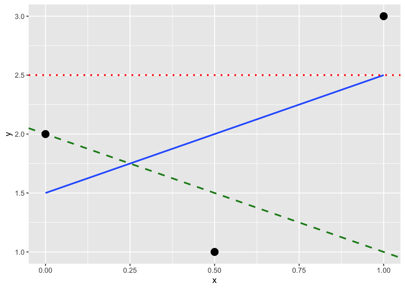
Figure 11.8: Regression line and two others.
Compute the sum of squared residuals by hand for each line and show that of these three lines, the regression line in blue has the smallest value.
11.4 A case study
Problem statement
Why do some professors and instructors at universities and colleges receive high teaching evaluations scores from students whereas others receive lower ones? Are there differences in teaching evaluations between instructors of different demographic groups? Could there be an impact due to student biases? These are all questions that are of interest to university/college administrators, as teaching evaluations are among the many criteria considered in determining which instructors and professors get promoted. Researchers at the University of Texas in Austin, Texas (UT Austin) tried to answer the following research question: what factors explain differences in instructor teaching evaluation scores? To this end, they collected instructor and course information on 463 course.
In this exercise, we will try to explain differences in instructor teaching scores as a function of one numerical variable: the instructor’s “beauty” score. Could it be that instructors with higher “beauty” scores also have higher teaching evaluations? Could it be instead that instructors with higher “beauty” scores tend to have lower teaching evaluations? Or could it be that there is no relationship between “beauty” score and teaching evaluations? We’ll answer these questions by modeling the relationship between teaching scores and “beauty” scores using simple linear regression where we have:
A numerical outcome variable \(y\) (the instructor’s teaching score) and
A single numerical explanatory variable \(x\) (the instructor’s “beauty” score).
11.4.1 Exploring the data
The data on the 463 courses at UT Austin
can be found in the evals data frame included in the moderndive package.
However, to keep things simple,
Let’s only select() the subset of the variables
you need to consider in this example,
and save this data in a new data frame called evals_simple:
Eyeballing the data
Rows: 463
Columns: 4
$ ID      <int> 1, 2, 3, 4, 5, 6, 7, 8, 9, 10, 11, 12, 13, 14, 15, 16, 17, 18…
$ score   <dbl> 4.7, 4.1, 3.9, 4.8, 4.6, 4.3, 2.8, 4.1, 3.4, 4.5, 3.8, 4.5, 4…
$ bty_avg <dbl> 5.000, 5.000, 5.000, 5.000, 3.000, 3.000, 3.000, 3.333, 3.333…
$ age     <int> 36, 36, 36, 36, 59, 59, 59, 51, 51, 40, 40, 40, 40, 40, 40, 4…
Observe that Observations: 463 indicates that
there are 463 rows/observations in evals_simple,
where each row corresponds to one observed course at UT Austin.
It is important to note that the observational unit
is an individual course and not an individual instructor.
Since some instructors teach more than one course in an academic year,
the same instructor may appear more than once in the data.
Hence there are fewer than 463 unique instructors
being represented in evals_simple.
A full description of all the variables included in evals
can be found at openintro.org
or by reading the associated help file (run ?moderndive::evals in the console).
Below is a list of descriptions for the 4 variables
we have selected in evals_simple:
ID: An identification variable used to distinguish between the 1 through 463 courses in the dataset.score: A numerical variable of the course instructor’s average teaching score, where the average is computed from the evaluation scores from all students in that course. Teaching scores of 1 are lowest and 5 are highest. This is the outcome variable \(y\) of interest.bty_avg: A numerical variable of the course instructor’s average “beauty” score, where the average is computed from a separate panel of six students. “Beauty” scores of 1 are lowest and 10 are highest. This is the explanatory variable \(x\) of interest.age: A numerical variable of the course instructor’s age. This will be another explanatory variable \(x\) that will be used in an exercise.
An alternative way to look at the raw data values
is by choosing a random sample of the rows in evals_simple
by piping it into the sample_n() function from the dplyr package.
Here we set the size argument to be 5,
indicating that we want a random sample of 5 rows.
We display the results below.
Note that due to the random nature of the sampling,
you will likely end up with a different subset of 5 rows.
| ID | score | bty_avg | age |
|---|---|---|---|
| 356 | 5.0 | 3.333 | 50 |
| 327 | 3.8 | 2.333 | 64 |
| 263 | 4.8 | 3.167 | 52 |
| 84 | 4.2 | 4.167 | 45 |
| 369 | 4.2 | 3.333 | 38 |
Summary statistics — univariate
Now that we’ve looked at the raw values in our evals_simple data frame
and got a preliminary sense of the data,
let’s continue with computing summary statistics for the target variables —
an instructor’s teaching score on a course
and the instructor’s “beauty” score denoted as bty_avg.
As before, we will use the customized function my_skim().
If you are coming back to this section since last time you have created my_skim(),
you will need to run the next chunk first.
# Create a template function for descriptives
my_skim <- skimr::skim_with(base = skimr::sfl(n = length, missing = skimr::n_missing),
                     numeric = skimr::sfl(
                                          mean,
                                          sd,
                                          iqr = IQR,
                                          min,
                                          p25 = ~ quantile(., 1/4),
                                          median,
                                          p75 = ~ quantile(., 3/4),
                                          max
                                          ),
                            append = FALSE
) #sfl stands for "skimr function list"| skim_variable | n | missing | mean | sd | iqr | min | p25 | median | p75 | max |
|---|---|---|---|---|---|---|---|---|---|---|
| score | 463 | 0 | 4.17 | 0.54 | 0.80 | 2.30 | 3.80 | 4.30 | 4.6 | 5.00 |
| bty_avg | 463 | 0 | 4.42 | 1.53 | 2.33 | 1.67 | 3.17 | 4.33 | 5.5 | 8.17 |
Looking at this output, we can see how the values of both variables distribute. For example, the mean teaching score was 4.17 out of 5, whereas the mean “beauty” score was 4.42 out of 10. The boxplots below complement the information in Table 11.7.
gg$ggplot(evals_simple,
  # `x = ""` is necessary when there is only one vector to plot
          gg$aes(x = "", y = score)) +
          gg$geom_boxplot() +
  # add the mean to the boxplot
  gg$stat_summary(fun=mean, geom="point", shape=5, size=4) +
  gg$geom_jitter(position = gg$position_jitter(width = 0.1, height = 0), alpha = 0.2) +
  # remove x axis title
  gg$theme(axis.title.x = gg$element_blank()
        )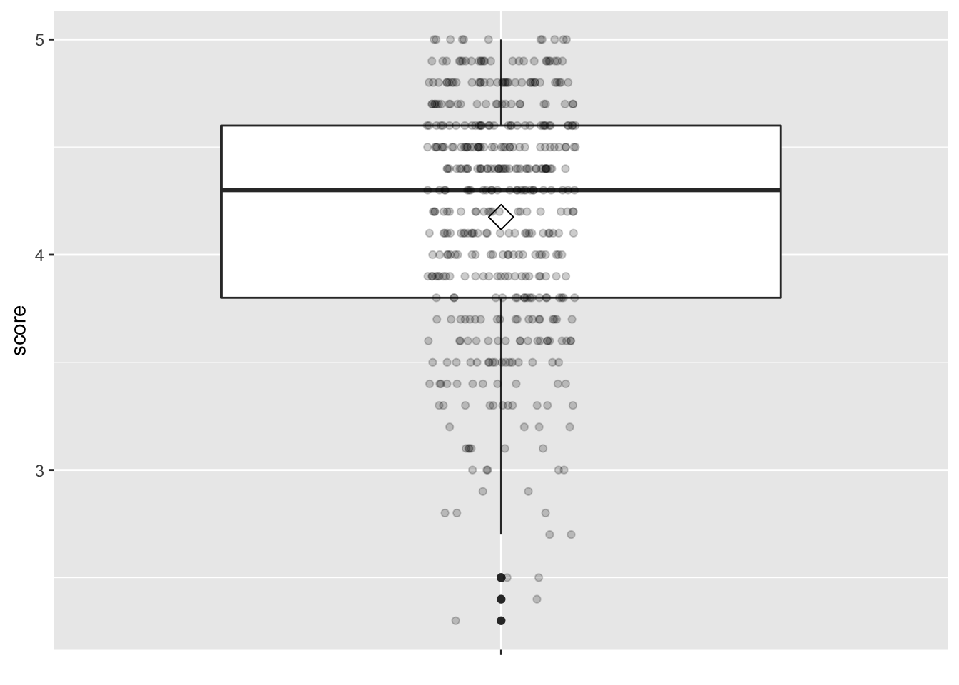
Figure 11.9: Boxplot of instructor’s teaching scores
gg$ggplot(evals_simple,
  # `x = ""` is necessary when there is only one vector to plot
          gg$aes(x = "", y = bty_avg)) +
          gg$geom_boxplot() +
    # add the mean to the boxplot
  gg$stat_summary(fun=mean, geom="point", shape=5, size=4) +
  gg$geom_jitter(position = gg$position_jitter(width = 0.1, height = 0), alpha = 0.2) +
  # remove x axis title
  gg$theme(axis.title.x = gg$element_blank()
        )
Figure 11.10: Boxplot of instructor’s ‘beauty’ scores
Summary statistics — bivariate
gg$ggplot(evals_simple, gg$aes(x = bty_avg, y = score)) +
  gg$geom_point() +
  gg$labs(x = "Beauty Score",
       y = "Teaching Score")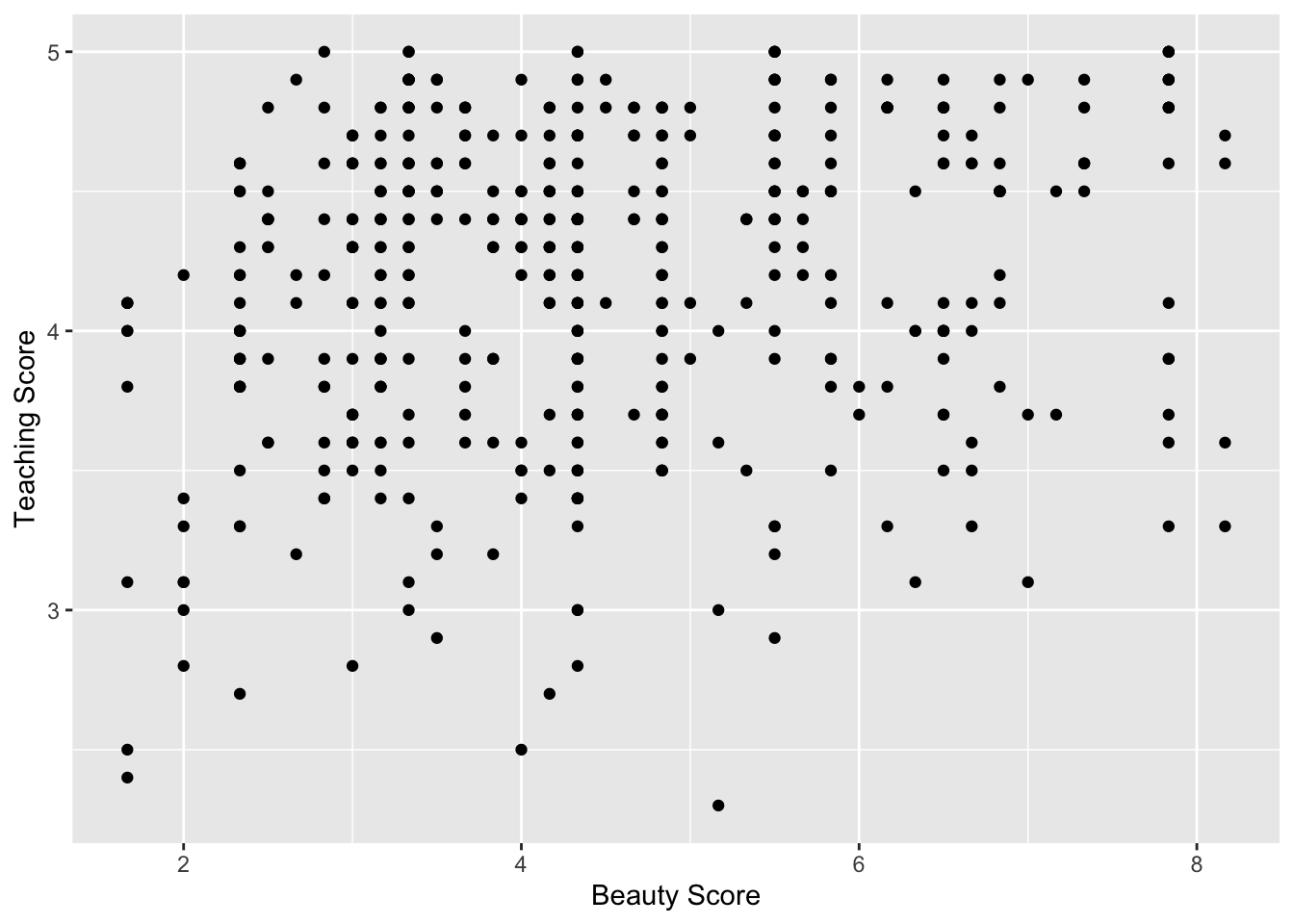
Figure 11.11: Relationship of teaching and beauty scores
Observe that most “beauty” scores lie between 2 and 8, while most teaching scores lie between 3 and 5. Furthermore, the relationship between teaching score and “beauty” score seems “weakly positive.”
Computing the correlation coefficient confirms this intuition:
# A tibble: 1 x 1
  correlation
        <dbl>
1       0.187
11.4.2 Simple linear regression
Recall that there are two steps involved in fitting a simple linear regression model to the data:
“fit” the linear regression model using the
lm()function and save it inscore_model.get the regression table by applying the
get_regression_table()function from themoderndivepackage toscore_model
# Fit regression model:
score_model <- lm(score ~ bty_avg, data = evals_simple)
# Get regression table:
moderndive::get_regression_table(score_model, digits = 3, print = TRUE)| term | estimate | std_error | statistic | p_value | lower_ci | upper_ci |
|---|---|---|---|---|---|---|
| intercept | 3.880 | 0.076 | 50.961 | 0 | 3.731 | 4.030 |
| bty_avg | 0.067 | 0.016 | 4.090 | 0 | 0.035 | 0.099 |
When we say “fit,” we mean “find the best fitting line to this data.”
lm() stands for “linear model” and is used as follows:
lm(y ~ x, data = data_frame_name) where:
yis the outcome variable, followed by a tilde~. In our case,yis set toscore, which represents the teaching score an instructor received for a given course.xis the explanatory variable. In our case,xis set to an instructor’s “beauty” score, orbty_avg.The combination of
y ~ xis called a model formula. (Note the order ofyandx.) In our case, the model formula isscore ~ bty_avg.data_frame_nameis the name of the data frame that contains the variablesyandx. In our case,data_frame_nameis theevals_simpledata frame.
The get_regression_table() function takes a saved lm() linear regression model
as input and returns a data frame of the regression table as output.
If you’re interested in learning more
about the get_regression_table() function’s inner workings,
check out Section 11.5.2.
Visualize
Let’s build on the scatterplot in Figure 11.11
by adding a “best-fitting” line:
of all possible lines we can draw on this scatterplot,
it is the line that “best” fits through the cloud of points.
We do this by adding a new geom_smooth(method = "lm", se = FALSE) layer
to the ggplot() code that created the scatterplot
in Figure 11.11.
The method = "lm" argument sets the line to be a “linear model.”
The se = FALSE argument suppresses standard error uncertainty bars.
gg$ggplot(evals_simple, gg$aes(x = bty_avg, y = score)) +
  gg$geom_point() +
  gg$labs(x = "Beauty Score", y = "Teaching Score",
       title = "Relationship between teaching and beauty scores") +
  gg$geom_smooth(method = "lm", se = FALSE)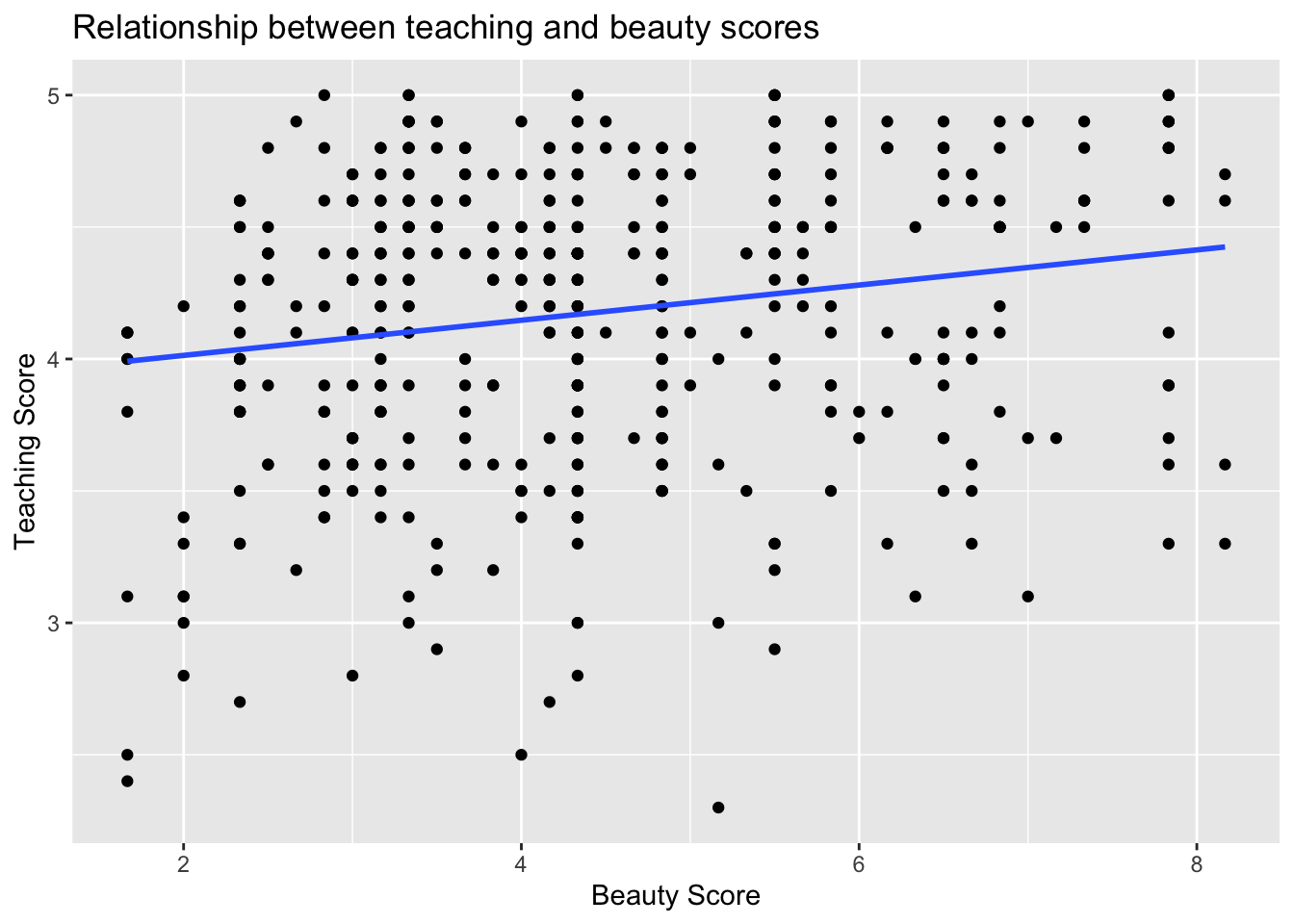
Figure 11.12: Regression line.
The line in the resulting Figure 11.12
is called a “regression line.”
The regression line is a visual summary of the relationship
between two numerical variables,
in our case the outcome variable score and the explanatory variable bty_avg.
The positive slope of the blue line is consistent
with our earlier observed correlation coefficient of 0.187
suggesting that there is a positive relationship between these two variables:
as instructors have higher “beauty” scores,
so also do they receive higher teaching evaluations.
Furthermore, a regression line is “best-fitting” in that
it minimizes the sum of squared residuals.
11.4.3 Interpretation
In the estimate column of Table 11.8
are the intercept \(b_0\) = 3.88
and the slope \(b_1\) = 0.07 for bty_avg.
Thus the equation of the regression line follows:
\[ \begin{aligned} \widehat{y} &= b_0 + b_1 \cdot x\\ \widehat{\text{score}} &= b_0 + b_{\text{bty}\_\text{avg}} \cdot\text{bty}\_\text{avg}\\ &= 3.88 + 0.067\cdot\text{bty}\_\text{avg} \end{aligned} \]
The intercept \(b_0\) = 3.88
is the average teaching score \(\widehat{y}\) = \(\widehat{\text{score}}\)
for those courses where the instructor had a “beauty” score bty_avg of 0.
Or in graphical terms,
it’s where the line intersects the \(y\) axis when \(x\) = 0.
Note, however, that while the intercept of the regression line
has a mathematical interpretation, it has no practical interpretation here,
given that the average of six panelists’ “beauty” scores range from 1 to 10
and observing a bty_avg of 0 is impossible.
Furthermore, looking at the scatterplot with the regression line
in Figure 11.1,
no instructors had a “beauty” score anywhere near 0.
Of greater interest is the slope \(b_1\) = \(b_{\text{bty_avg}}\) for bty_avg
of 0.067,
as this summarizes the relationship
between the teaching and “beauty” score variables.
Note that the sign is positive,
suggesting a positive relationship between these two variables,
meaning teachers with higher beauty scores also tend to have higher teaching scores.
The slope’s interpretation is:
For every increase of 1 unit in
bty_avg, there is an associated increase of, on average, 0.07 units ofscore.
We only state that there is an associated increase and not necessarily a causal increase. For example, perhaps it’s not that higher “beauty” scores directly cause higher teaching scores per se. Instead, the following could hold true: individuals from wealthier backgrounds tend to have stronger educational backgrounds and hence have higher teaching scores, while at the same time these wealthy individuals also tend to have higher “beauty” scores. In other words, just because two variables are strongly associated, it doesn’t necessarily mean that one causes the other. This is summed up in the often quoted phrase, “correlation is not necessarily causation.”
Furthermore, we say that this associated increase is on average
0.07 units of teaching score,
because you might have two instructors whose bty_avg scores differ by 1 unit,
but their difference in teaching scores won’t necessarily be exactly
0.07.
What the slope of 0.07 is saying
is that across all possible courses,
the average difference in teaching score
between two instructors whose “beauty” scores differ by one
is 0.07.
Learning check
(LC11.2)
Conduct a new linear regression analysis
with the same outcome variable \(y\) being score
but with age as the new explanatory variable \(x\).
Remember, this involves the following steps:
- Eyeballing the raw data
- Creating data visualizations
- Computing summary statistics, both univariate and bivariate. What can you say about the relationship between age and teaching scores?
- Fitting a simple linear regression
where
ageis the explanatory variable \(x\) andscorebeing the outcome variable \(y\) - Interpreting results of the “best-fitting” line based on informtion in the regression table
How do the regression results match up with the results from the first three steps?
11.5 Related topics
11.5.1 Correlation is not necessarily causation
Throughout this chapter we’ve been cautious
when interpreting regression slope coefficients.
We always discussed the “associated” effect of an explanatory variable \(x\)
on an outcome variable \(y\).
For example, our statement from Subsection 11.2 that
“For every increase of 1 unit in income,
there is an associated increase of, on average,
0.002 units of life expectancy.
We include the term”associated" to be extra careful
not to suggest we are making a causal statement.
So while income is positively correlated with life_exp,
we can’t necessarily make any statements about income’s direct causal effect
on life expectancy without more information on how this study was conducted.
Here is another example:
a not-so-great medical doctor goes through medical records
and finds that patients who slept with their shoes on
tended to wake up more with headaches.
So this doctor declares, “Sleeping with shoes on causes headaches!”

Figure 11.13: Does sleeping with shoes on cause headaches?
However, there is a good chance that if someone is sleeping with their shoes on, it’s potentially because they are intoxicated from alcohol. Furthermore, higher levels of drinking leads to more hangovers, and hence more headaches. The amount of alcohol consumption here is what’s known as a confounding/lurking variable. It “lurks” behind the scenes, confounding the causal relationship (if any) of “sleeping with shoes on” with “waking up with a headache.” We can summarize this in Figure 11.14 with a causal graph where:
- Y is a response variable; here it is “waking up with a headache.”
- X is a treatment variable whose causal effect we are interested in; here it is “sleeping with shoes on.”
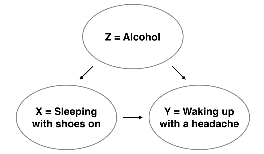
Figure 11.14: Causal graph.
To study the relationship between Y and X, we could use a regression model where the outcome variable is set to Y and the explanatory variable is set to be X, as you’ve been doing throughout this chapter. However, Figure 11.14 also includes a third variable with arrows pointing at both X and Y:
- Z is a confounding variable that affects both X and Y, thereby “confounding” their relationship. Here the confounding variable is alcohol.
Alcohol will cause people to be both more likely to sleep with their shoes on as well as be more likely to wake up with a headache. Thus any regression model of the relationship between X and Y should also use Z as an explanatory variable. In other words, our doctor needs to take into account who had been drinking the night before. In the next chapter, we will start covering multiple regression models that allow us to incorporate more than one variable in our regression models.
Establishing causation is a tricky problem and frequently takes either carefully designed experiments or methods to control for the effects of confounding variables. Both these approaches attempt, as best they can, either to take all possible confounding variables into account or negate their impact. This allows researchers to focus only on the relationship of interest: the relationship between the outcome variable Y and the treatment variable X.
As you read news stories, be careful not to fall into the trap of thinking that correlation necessarily implies causation. Check out the Spurious Correlations website for some rather comical examples of variables that are correlated, but are definitely not causally related.
11.5.2 get_regression_x() functions
Recall in this chapter we introduced two functions from the moderndive package:
get_regression_table()that returns a regression table in Subsection 11.2 andget_regression_points()that returns point-by-point information from a regression model in Subsection 11.3.
What is going on behind the scenes with the get_regression_table()
and get_regression_points() functions?
We mentioned in Subsection 11.2 that
these were examples of wrapper functions.
Such functions take other pre-existing functions
and “wrap” them into single functions
that hide from the user their inner workings.
This way all the user needs to worry about is
what the inputs look like and what the outputs look like.
In this subsection, we will “get under the hood” of these functions
and see how the “engine” of these wrapper functions works.
Recall our two-step process to generate a regression table from Subsection 11.2:
# Fit regression model:
health_model <- lm(life_exp ~ income, data = df_gapminder2007)
# Get regression table:
moderndive::get_regression_table(health_model)| term | estimate | std_error | statistic | p_value | lower_ci | upper_ci |
|---|---|---|---|---|---|---|
| intercept | 4.950 | 3.858 | 1.283 | 0.202 | -2.677 | 12.576 |
| income | 0.002 | 0.000 | 16.283 | 0.000 | 0.001 | 0.002 |
The get_regression_table() wrapper function
takes two pre-existing functions in other R packages:
tidy()from thebroompackage (Robinson, Hayes, and Couch 2021) andclean_names()from thejanitorpackage (Firke 2021)
and “wraps” them into a single function
that takes in a saved lm() linear model, here health_model,
and returns a regression table saved as a “tidy” data frame.
Here is how we used the tidy() and clean_names() functions
to produce Table 11.10:
health_model %>%
  broom::tidy(conf.int = TRUE) %>%
  dplyr::mutate_if(is.numeric, round, digits = 3) %>%
  janitor::clean_names() %>%
dplyr::rename(lower_ci = conf_low, upper_ci = conf_high)| term | estimate | std_error | statistic | p_value | lower_ci | upper_ci |
|---|---|---|---|---|---|---|
| (Intercept) | 4.950 | 3.858 | 1.283 | 0.202 | -2.677 | 12.576 |
| income | 0.002 | 0.000 | 16.283 | 0.000 | 0.001 | 0.002 |
Yikes! That’s a lot of code!
So, in order to simplify your lives,
we made the editorial decision to “wrap” all the code
into get_regression_table(),
freeing you from the need to understand the inner workings of the function.
Note that the mutate_if() function is from the dplyr package
and applies the round() function to three significant digits precision
only to those variables that are numerical.
Similarly, the get_regression_points() function
is another wrapper function,
but this time returning information about the individual points
involved in a regression model like the fitted values, observed values,
and the residuals.
get_regression_points()
uses the augment() function
in the broom package
instead of the tidy() function as with get_regression_table()
to produce the data shown in Table 11.11:
health_model %>%
  broom::augment() %>%
  dplyr::mutate_if(is.numeric, round, digits = 3) %>%
  janitor::clean_names() %>%
dp$select(-c("std_resid", "hat", "sigma", "cooksd", "std_resid"))| life_exp | income | fitted | resid |
|---|---|---|---|
| 43.828 | 29888.18 | 54.519 | -10.691 |
| 76.423 | 37735.69 | 67.534 | 8.889 |
| 72.301 | 37940.25 | 67.874 | 4.427 |
| 42.731 | 36809.91 | 65.999 | -23.268 |
| 75.320 | 41065.10 | 73.056 | 2.264 |
| 81.235 | 45370.05 | 80.196 | 1.039 |
| 79.829 | 45578.26 | 80.541 | -0.712 |
| 75.635 | 44741.59 | 79.154 | -3.519 |
| 64.062 | 31434.06 | 57.083 | 6.979 |
| 79.441 | 45275.35 | 80.039 | -0.598 |
In this case, it outputs only the variables of interest
to students learning regression:
the outcome variable \(y\) (life_exp),
all explanatory/predictor variables (income),
all resulting fitted values \(\hat{y}\) used
by applying the equation of the regression line to income,
and the residual \(y - \hat{y}\).
If you’re even more curious about how these and other wrapper functions work, take a look at the source code for these functions on GitHub.
11.6 Conclusion
11.6.1 Additional resources
As we suggested in Subsection 11.1, interpreting coefficients that are not close to the extreme values of -1, 0, and 1 can be somewhat subjective. To help develop your sense of correlation coefficients, we suggest you play the 80s-style video game called, “Guess the Correlation,” at http://guessthecorrelation.com/.
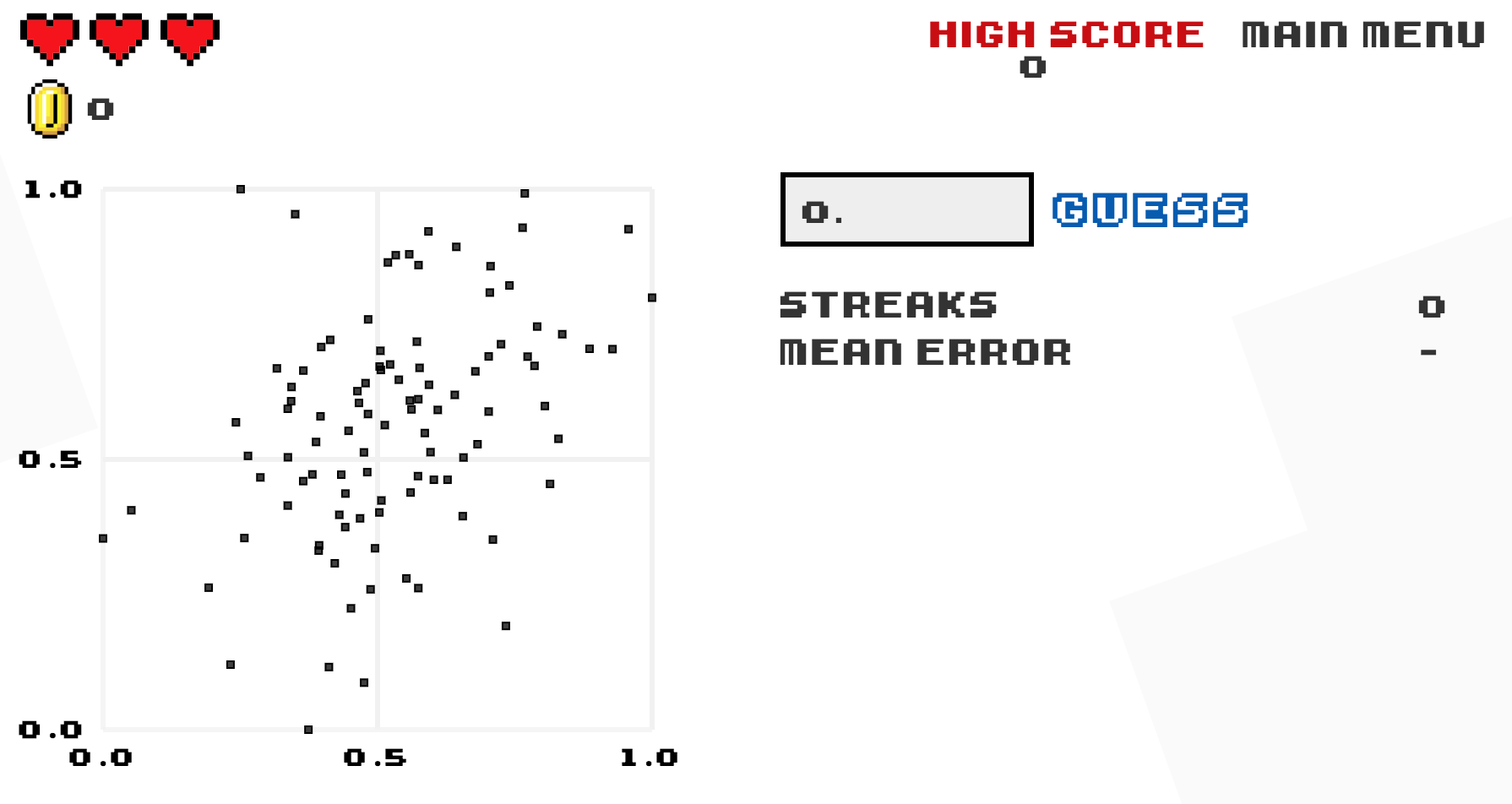
Figure 11.15: Preview of “Guess the Correlation” game.
11.6.2 What’s to come?
In this chapter, we have introduced simple linear regression,
where we fit models that have one continuous explanatory variable.
We also demonstrated how to interpret resutls from a regression table
such as Table 11.3.
However, we have only focused on the two leftmost columns: term and estimate.
In the next chapter, we will pick up where we left off
and focus on the remaining columns including std_error and p_value.