Chapter 7 Hypothesis Testing
Now that we have studied confidence intervals in Chapter 6, let’s study another commonly used method for statistical inference: hypothesis testing. Hypothesis tests allow us to take a sample of data from a population and infer about the plausibility of competing hypotheses. For example, in the upcoming “promotions” activity in Section 7.1, you’ll study the data collected from a psychology study in the 1970s to investigate whether gender-based discrimination in promotion rates existed in the banking industry at the time of the study.
The good news is we’ve already covered many of the necessary concepts in Chapters 5 and 6 to understand hypothesis testing. We will expand further on these ideas here and also provide a general framework for understanding hypothesis tests. By understanding this general framework, you’ll be able to adapt it to many different scenarios.
The same can be said for confidence intervals.
There was one general framework that applies to all confidence intervals
and the infer package was designed around this framework.
While the specifics may change slightly
for different types of confidence intervals,
the general framework stays the same.
Needed packages
Let’s get ready all the packages we will need for this chapter.
# Install xfun so that I can use xfun::pkg_load2
if (!requireNamespace('xfun')) install.packages('xfun')
xf <- loadNamespace('xfun')

cran_packages <- c(
                  "dplyr",
                  "ggplot2",
                  "infer",
                  "moderndive" # we introduce a new package "moderndive" in this chapter
)

if (length(cran_packages) != 0) xf$pkg_load2(cran_packages)

gg <- import::from(ggplot2, .all=TRUE, .into={new.env()})
dp <- import::from(dplyr, .all=TRUE, .into={new.env()})

import::from(magrittr, "%>%")
import::from(patchwork, .all=TRUE)
7.1 Promotions activity
Let’s start with an activity studying the effect of gender on promotions at a bank.
7.1.1 Does gender affect promotions at a bank?
Say you are working at a bank in the 1970s and you are submitting your résumé to apply for a promotion. Will your gender affect your chances of getting promoted? To answer this question, we will use a subset of the original data from a study published in the Journal of Applied Psychology in 1974 (Rosen and Jerdee 1974).
To begin the study, 48 bank supervisors were asked to assume the role of a hypothetical director of a bank with multiple branches. Every one of the bank supervisors was given a résumé and asked whether or not the candidate on the résumé was fit to be promoted to a new position in one of their branches.
However, each of these 48 résumés were identical in all respects except one: the name of the applicant at the top of the résumé. Of the supervisors, 24 were randomly given résumés with stereotypically “male” names, while 24 of the supervisors were randomly given résumés with stereotypically “female” names. Since only (binary) gender varied from résumé to résumé, researchers could isolate the effect of this variable in promotion rates.
While many people today (including us, the authors) disagree with such binary views of gender, it is important to remember that this study was conducted at a time where more nuanced views of gender were not as prevalent. Despite this imperfection, we decided to still use this example as we feel it presents ideas still relevant today about how we could study discrimination in the workplace.
The moderndive package contains the data on the 48 applicants
in the promotions data frame.
Let’s explore this data by looking at six randomly selected rows:
# let's import the data frame "promotions" from its package "moderndive"
import::from(moderndive, promotions)
promotions %>%
  dp$slice_sample(n = 6) %>%
  dp$arrange(id)
# A tibble: 6 x 3
id decision gender
<int> <fct> <fct>
1 11 promoted male
2 26 promoted female
3 28 promoted female
4 36 not male
5 37 not male
6 46 not femaleThe variable id acts as an identification variable for all 48 rows.
The decision variable indicates whether the applicant was selected
for promotion or not,
whereas the gender variable indicates the gender of the name used on the résumé.
Recall that this data does not pertain to 24 actual men
and 24 actual women,
but rather 48 identical résumés
of which 24 were assigned stereotypically “male” names
and 24 were assigned stereotypically “female” names.
Let’s perform an exploratory data analysis of the relationship
between the two categorical variables decision and gender.
Recall that we saw in Subsection 2.8.3
that one way we can visualize such a relationship is by using a stacked barplot.
promotions_barplot <- gg$ggplot(promotions,
                                gg$aes(x = gender, fill = decision)) +
                   gg$geom_bar() +
                   gg$labs(x = "Gender of name on résumé") +
                   gg$scale_fill_manual(values = c("dimgray", "lawngreen"))
promotions_barplot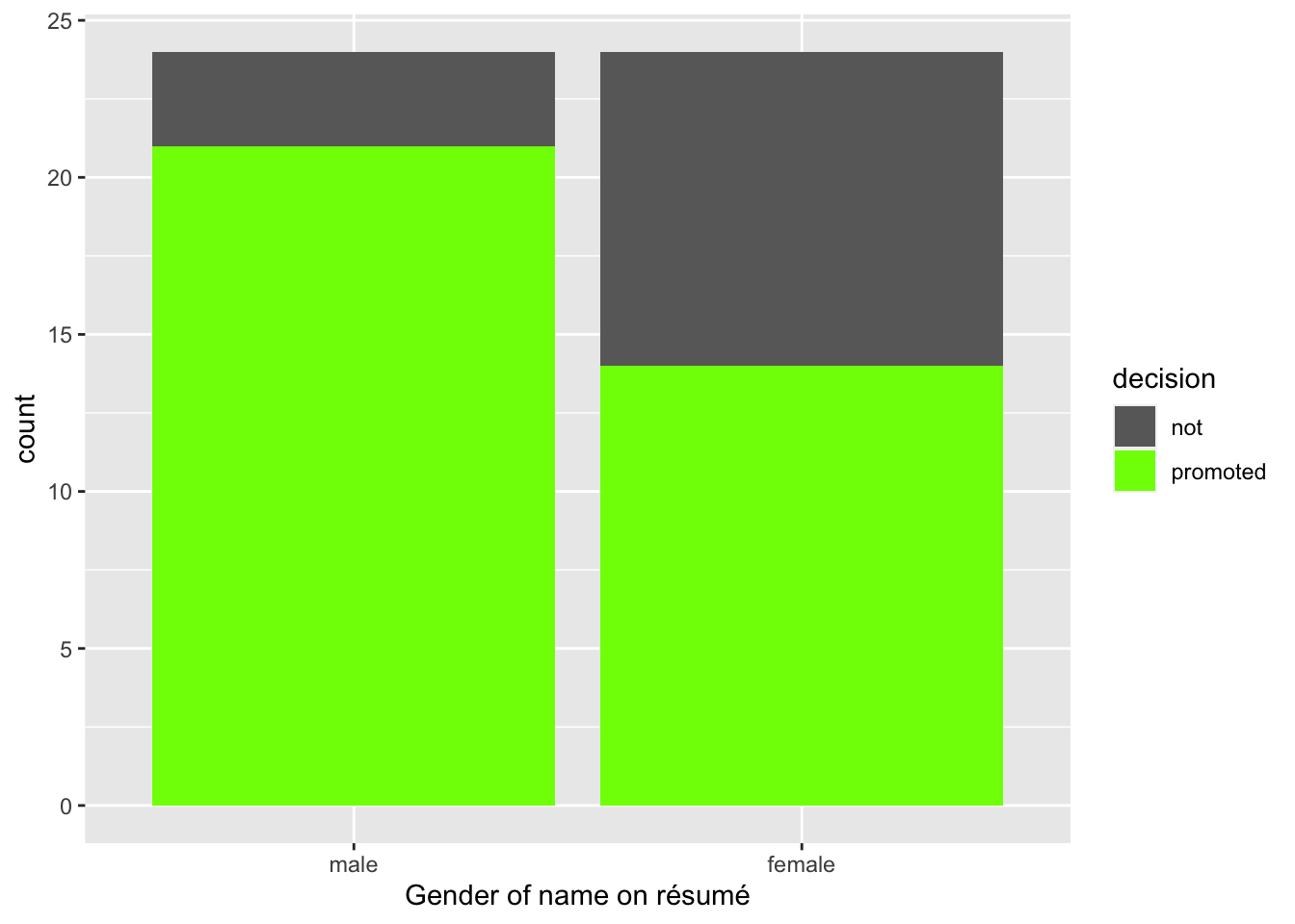
Figure 7.1: “Promoted” vs. “non-promoted” within each gender group.
Observe in Figure 7.1
that it appears that résumés with female names were much less likely
to be accepted for promotion.
Let’s quantify these promotion rates by computing the proportion of résumés
accepted for promotion for each group using the dplyr package for data wrangling.
# A tibble: 4 x 3
  gender decision     n
  <fct>  <fct>    <int>
1 male   not          3
2 male   promoted    21
3 female not         10
4 female promoted    14
So of the 24 résumés with male names, 21 were selected for promotion, for a proportion of 21/24 = 0.875 = 87.5%. On the other hand, of the 24 résumés with female names, 14 were selected for promotion, for a proportion of 14/24 = 0.583 = 58.3%. Comparing these two rates of promotion, it appears that résumés with male names were selected for promotion at a rate 0.875 - 0.583 = 0.292 = 29.2% higher than résumés with female names. This is suggestive of an advantage for résumés with a male name on it.
The question is, however, does this provide conclusive evidence that there is gender discrimination in promotions at banks? Could a difference in promotion rates of 29.2% still occur by chance, even in a hypothetical world where no gender-based discrimination existed? In other words, what is the likelihood that sampling variation alone could account for a result suggestive of gender discrimination like the one we just saw in a world where there is actually no gender discrimination? To answer this question, we will again introduce both a theory-based and a simulation-based approach in this chapter. Let’s start with the simulation-based approach.
Learning check
(LC7.1)
In Figure 7.1,
we visualized promotions in terms of
the ratio of promoted vs. not-promoted within each gender group.
Another way to visualize the same data would be
swap the variable on the x-axis with fill,
as in the next code chunk.
Run the code below and compare the result with Figure 7.1. What insights could you glean by comparing them? Which one, in your opinion, conveys the message more clearly?
promotions_barplot_flip <- gg$ggplot(promotions,
                                     gg$aes(x = decision, fill = gender)) +
                   gg$geom_bar() +
                   gg$labs(x = "Promotion decisions on résumé") +
                   gg$scale_fill_manual(values = c("cornflowerblue", "coral"))
promotions_barplot_flip
7.1.2 Shuffling once
Recall that in the original promotions data,
of the 35 résumés selected for promotion,
14 were women,
whereas 21 were man.
Let us zoom in on this result,
particularly how likely this result could occure
in our hypothetical userverse where there is no gender discrimination.
In such as hypothetical universe,
the gender of an applicant would be irrelevant.
In other words, if a 14 female : 21 male
ratio happened by chance,
so could a 25:10 ratio, or a 17:18 ratio.
Let me illustrate a process which could give rise to those scenarios using the following thought experiment:
- Picture two boxes in front of you,
- One box is labeled “promoted,” the other “not-promoted.”
- The “promoted” box has 35 slots, whereas the “not-promoted” box has 13 slots. In total, there are \(35 + 13 = 48\) slots.
- From the 48 résumés, randomly select 35 of them and place them in each of the 35 slots of the “promoted” box.
- Place the remaining 13 résumés into the slots of the “not-promoted” box.
- Among the résumés in the “promoted” box, count the number of female and male names, respectively.
- Repeat the last step for the “not-promoted” box.
- Record the counts.
I have carried out this thought experiment once and generated the following results:
# A tibble: 4 x 3
  gender decision     n
  <fct>  <fct>    <int>
1 male   not          6
2 male   promoted    18
3 female not          7
4 female promoted    17
Let’s repeat the same exploratory data analysis we did
for the original promotions data on this new data frame.
Let’s create a barplot visualizing the relationship between
decision and the gender variable
and compare this to the original version in Figure 7.2.
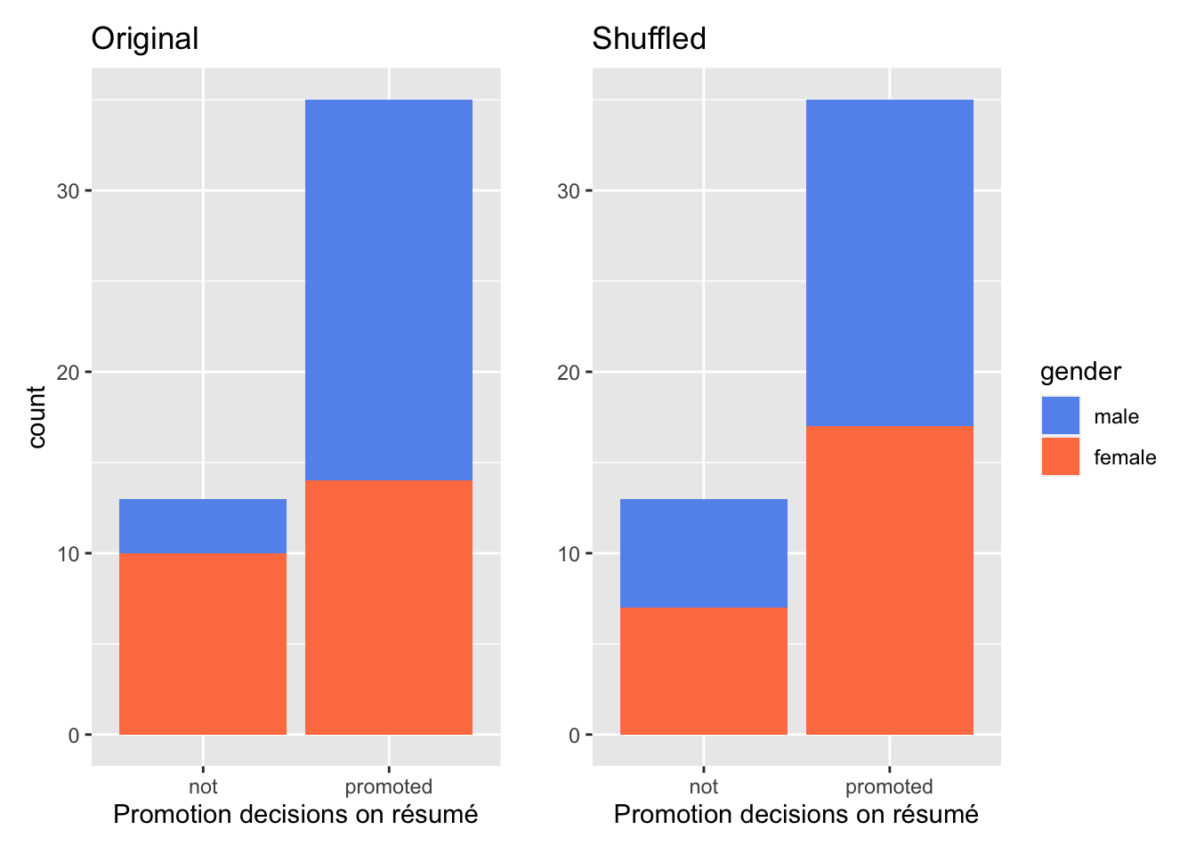
Figure 7.2: Relationship between promotion and gender for original data (left) and simulated data in the hypothesized world (right).
Compare the two barplots in Figure 7.2. what has remained the same? The same 24 male and female résumés were involved in both scenarios. The same total number of résumés ended up in the promoted / not-promoted bin. The only thing that changed is who landed in the promoted bin vs. the not-promoted bin. As a result, the male/female ratio within each promotion decision group are different. Think of the 48 résumés as cards. We just shuffled them once in terms who landed in which bin.

Figure 7.3: Shuffling a deck of cards.
Let’s examine the proportion of résumés accepted for promotion in each gender group for this shuffled data frame.
# let's import "promotions_shuffled" from package "moderndive"
import::from(moderndive, promotions_shuffled)
promotions_shuffled %>%
  dp$count(gender, decision)
# A tibble: 4 x 3
gender decision n
<fct> <fct> <int>
1 male not 6
2 male promoted 18
3 female not 7
4 female promoted 17So in this hypothetical universe of no discrimination, \(18/48 = 0.75 = 75\%\) of “male” résumés were selected for promotion. On the other hand, \(17/48 = 0.708 = 70.8\%\) of “female” résumés were selected for promotion. Based on these results, we can say that résumés with stereotypically male names were selected for promotion at a rate that was \(0.75 - 0.708 = 0.042 = 4.2\%\) different than résumés with stereotypically female names.
Observe how this difference in rates is not the same as the difference in rates of \(0.292 = 29.2%\) we originally observed. This is once again due to sampling variation.
To better understand the effect of this sampling variation, let’s generate a few more simulated datasets by shuffling under the no-discrimination hypothesis.
7.1.3 Shuffling 20 times
We have seen how one shuffling resulted in a new difference in promotion rates between two genders. Let’s shuffle 20 times to generate 20 such results.
Picture this: a deck of 48 cards, with 24 red and 24 black. I shuffle them thoroughly, then place 35 of them into the “promoted” box, and the remaining 13 of them into the “non-promoted” box. Afterwards, I take the cards out of each box, count the number of red cards (female résumé) and black cards (male résumé), write them down. I repeated this process 20 times. In the end, I obtained the following data frame:
| replicate | male_not_promoted | male_promoted | female_not_promoted | female_promoted |
|---|---|---|---|---|
| 1 | 5 | 19 | 8 | 16 |
| 2 | 6 | 18 | 7 | 17 |
| 3 | 4 | 20 | 9 | 15 |
| 4 | 7 | 17 | 6 | 18 |
| 5 | 8 | 16 | 5 | 19 |
| 6 | 5 | 19 | 8 | 16 |
| 7 | 5 | 19 | 8 | 16 |
| 8 | 5 | 19 | 8 | 16 |
| 9 | 7 | 17 | 6 | 18 |
| 10 | 11 | 13 | 2 | 22 |
| 11 | 7 | 17 | 6 | 18 |
| 12 | 7 | 17 | 6 | 18 |
| 13 | 7 | 17 | 6 | 18 |
| 14 | 8 | 16 | 5 | 19 |
| 15 | 8 | 16 | 5 | 19 |
| 16 | 5 | 19 | 8 | 16 |
| 17 | 7 | 17 | 6 | 18 |
| 18 | 8 | 16 | 5 | 19 |
| 19 | 6 | 18 | 7 | 17 |
| 20 | 7 | 17 | 6 | 18 |
Using these numbers, I computed the difference in promotion rates between male and female from each shuffle, then plotted them in Figure 7.4.
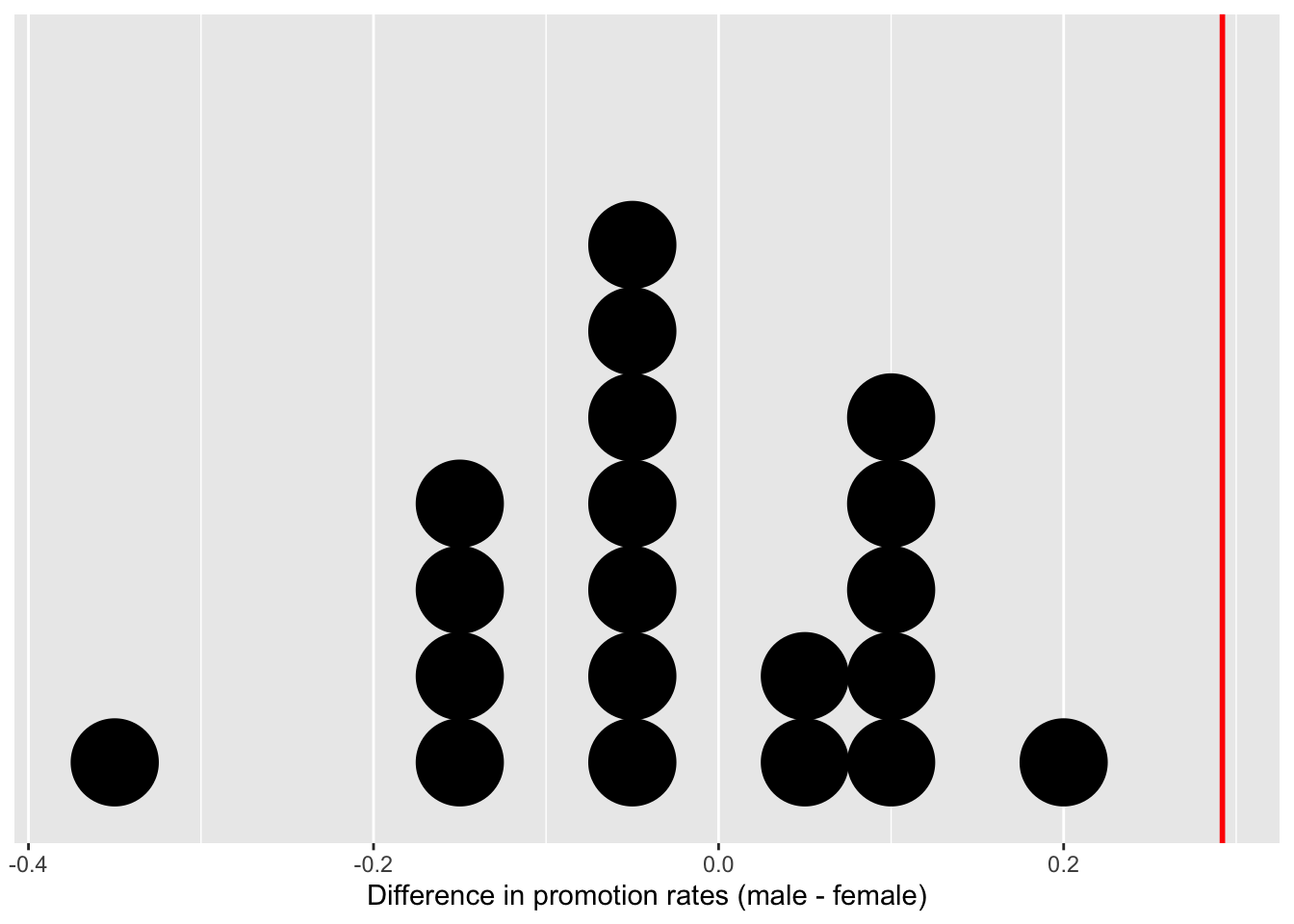
Figure 7.4: Distribution of differences in promotion rates (20 samples).
Before we discuss the distribution in Figure 7.4, we emphasize the key thing to remember: this plot represents differences in promotion rates that one would observe in our hypothesized universe of no gender discrimination.
Observe first that the distribution is roughly centered at 0. Saying that the difference in promotion rates is 0 is equivalent to saying that both genders had the same promotion rate. In other words, the center of these 20 values is consistent with what we would expect in our hypothesized universe of no gender discrimination.
However, while the values are centered at 0, there is variation about 0. This is because even in a hypothesized universe of no gender discrimination, you will still likely observe small differences in promotion rates because of chance sampling variation. Looking at the distribution in Figure 7.4, such differences could even be as extreme as -0.375 or 0.208.
Time to scale this up!
7.1.4 Shuffle 1,000 times
By now, you already know the drill. Let me spare you the droning sound of 1,000 shuffles, and jump straight to the result!
Table 7.2 displays a snapshot of results from the first 10 out of the 1,000 shuffles.
| replicate | male_not_promoted | male_promoted | female_not_promoted | female_promoted |
|---|---|---|---|---|
| 1 | 5 | 19 | 8 | 16 |
| 2 | 5 | 19 | 8 | 16 |
| 3 | 6 | 18 | 7 | 17 |
| 4 | 6 | 18 | 7 | 17 |
| 5 | 4 | 20 | 9 | 15 |
| 6 | 4 | 20 | 9 | 15 |
| 7 | 8 | 16 | 5 | 19 |
| 8 | 8 | 16 | 5 | 19 |
| 9 | 10 | 14 | 3 | 21 |
| 10 | 9 | 15 | 4 | 20 |
As before, I computed the difference in promotion rates between male and female from each shuffle and plotted them in Figure 7.10. This time, I also marked the originally observed difference in promotion rate from the 1970 study, 0.292, with a solid red line.
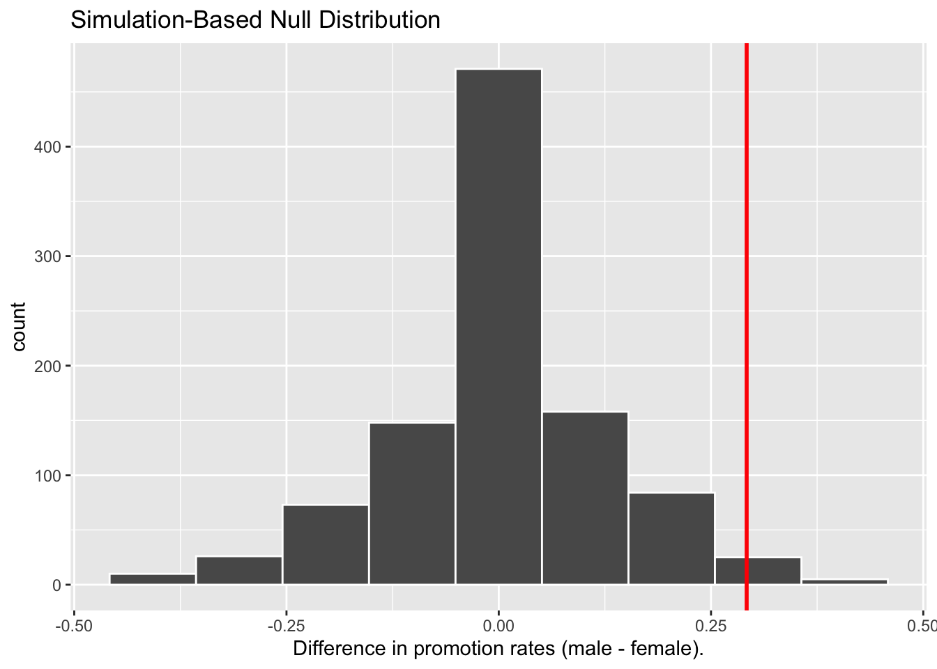
Figure 7.5: Differences in promotion rates from 1000 samples.
The histogram resemebles what we have seen in Figure 7.4: centering at 0 with variations around 0. Turning our attention to what we observed in real life: the difference of 0.292 = 29.2% is marked with a vertical red line. Judging by its location relative to the centre, can you tell how likely the we would observe this difference given the hypothesized world of no gender discrimination? While opinions here may differ, in our opinion not often! Now ask yourself: what do these results say about our hypothesized universe of no gender discrimination?
7.1.5 What did we just do?
What we just demonstrated in this activity is the statistical procedure known as hypothesis testing using a permutation test. The term “permutation” is the mathematical term for “shuffling”: taking a series of values and reordering them randomly, as we did with the deck of cards.
Shuffling/Permutation is another form of resampling, like the bootstrap method we have seen in Chapter 6. The bootstrap method involves resampling with replacement, whereas shuffling/permutation method involves resampling without replacement.
Think of our exercise involving the slips of paper representing banana weight in Section 6.3.1: after sampling a banana weight, you put it back in the tuque before drawing the next one. Now think of our deck of cards. After drawing a card, you place it in one of the boxes, and you did not put it back in the deck before drawing the next card.
In our previous example, we tested the validity of the hypothesized universe of no gender discrimination. The evidence contained in our observed sample of 48 résumés was somewhat inconsistent with our hypothesized universe, given how “untypical” the obtained result — 29.2% — appers relative to the majority of the simulated results from the no-discrimination universe. Thus, we would be inclined to reject this hypothesized universe and declare that the evidence suggests there is gender discrimination.
Recall our example of the confidence interval for the banana weight. That example involves an inference about an unknown population parameter \(\mu\), the average weight of bananas. This time, the population parameter, unknown to us, is \(p_{m} - p_{f}\), where \(p_{m}\) is the population proportion of résumés with male names being recommended for promotion and \(p_{f}\) is the equivalent for résumés with female names.
So, based on our sample of \(n_m\) = 24 “male” applicants and \(n_f\) = 24 “female” applicants, the point estimate for \(p_{m} - p_{f}\) is the difference in sample proportions \(\widehat{p}_{m} -\widehat{p}_{f}\) = 0.875 - 0.583 = 0.292 = 29.2%. This difference in favor of “male” résumés of 29.2% is greater than 0, suggesting discrimination in favor of men.
However, the question we asked ourselves was “is this difference meaningfully greater than 0?” In other words, is this difference indicative of true discrimination, or can we just attribute it to sampling variation? Hypothesis testing allows us to make such distinctions.
7.2 Understanding hypothesis tests
Much like the terminology, notation, and definitions relating to sampling you saw in Section 5.2.2, there are a lot of terminology, notation, and definitions related to hypothesis testing as well. Learning these may seem like a very daunting task at first. However, with practice, practice, and more practice, anyone can master them.
First, a hypothesis is a statement about the value of an unknown population parameter. Hypothesis tests can involve any of the population parameters in Table 7.3. In our résumé activity, our population parameter of interest is the difference in population proportions \(p_{m} - p_{f}\), the third scenario in Table 7.3.
| Scenario | Population Parameter | Notation | Point estimate | Symbol(s) |
|---|---|---|---|---|
| 1 | Population proportion | \(p\) | Sample proportion | \(\widehat{p}\) |
| 2 | Population mean | \(\mu\) | Sample mean | \(\widehat{\mu}\) or \(\bar{x}\) |
| 3 | Difference in population proportions | \(p_1 - p_2\) | Difference in sample proportions | \(\widehat{p}_1 - \widehat{p}_2\) |
| 4 | Difference in population means | \(\mu_1 - \mu_2\) | Difference in sample means | \(\bar{x}_1 - \bar{x}_2\) |
| 5 | Population regression slope | \(\beta_1\) | Fitted regression slope | \(\widehat{\beta}_1\) or \(b_1\) |
Second, a hypothesis test consists of a test between two competing hypotheses: (1) a null hypothesis \(H_0\) (pronounced “H-naught”) versus (2) an alternative hypothesis \(H_A\) (also denoted \(H_1\)).
Generally the null hypothesis is a claim that there is “no effect” or “no difference of interest.” In many cases, the null hypothesis represents the status quo or a situation that nothing interesting is happening. Furthermore, generally the alternative hypothesis is the claim the experimenter or researcher wants to establish or find evidence to support. It is viewed as a “challenger” hypothesis to the null hypothesis \(H_0\). In our résumé activity, an appropriate hypothesis test would be:
\[ \begin{aligned} H_0 &: \text{men and women are promoted at the same rate}\\ \text{vs } H_A &: \text{men are promoted at a higher rate than women} \end{aligned} \]
Note some of the choices we have made. First, we set the null hypothesis \(H_0\) to be that there is no difference in promotion rate and the “challenger” alternative hypothesis \(H_A\) to be that there is a difference. Although it would not be wrong in principle to reverse the two, it is a convention in statistical inference that the null hypothesis is set to reflect a “null” situation where “nothing is going on.” As we discussed earlier, in this case, \(H_0\) corresponds to there being no difference in promotion rates. Furthermore, we set \(H_A\) to be that men are promoted at a higher rate, a subjective choice reflecting a prior suspicion we have that this is the case. We call such alternative hypotheses one-sided alternatives. If someone else however does not share such suspicions and only wants to investigate that there is a difference, whether higher or lower, they would set what is known as a two-sided alternative.
We can re-express the formulation of our hypothesis test using the mathematical notation for our population parameter of interest, the difference in population proportions \(p_{m} - p_{f}\):
\[ \begin{aligned} H_0 &: p_{m} - p_{f} = 0\\ \text{vs } H_A&: p_{m} - p_{f} > 0 \end{aligned} \]
Observe how the alternative hypothesis \(H_A\) is one-sided with \(p_{m} - p_{f} > 0\). Had we opted for a two-sided alternative, we would have set \(p_{m} - p_{f} \neq 0\). To keep things simple for now, we’ll stick with the simpler one-sided alternative.
Third, a test statistic is a point estimate/sample statistic formula used for hypothesis testing. Note that a sample statistic is merely a summary statistic based on a sample of observations. Recall we saw in Section 3.4 that a summary statistic aggregates many values into one. Here, the samples would be the \(n_m\) = 24 résumés with male names and the \(n_f\) = 24 résumés with female names. Hence, the point estimate of interest is the difference in sample proportions \(\widehat{p}_{m} - \widehat{p}_{f}\).
Fourth, the observed test statistic is the value of the test statistic that we observed in real life. In our case, we computed this value using the data saved in the promotions data frame. It was the observed difference of \(\widehat{p}_{m} -\widehat{p}_{f} = 0.875 - 0.583 = 0.292 = 29.2\%\) in favor of résumés with male names.
Fifth, the null distribution is the sampling distribution of the test statistic assuming the null hypothesis \(H_0\) is true. Ooof! That’s a long one! Let’s unpack it slowly. The key to understanding the null distribution is that the null hypothesis \(H_0\) is assumed to be true. We’re not saying that \(H_0\) is true at this point, we’re only assuming it to be true for hypothesis testing purposes. In our case, this corresponds to our hypothesized universe of no gender discrimination in promotion rates. Assuming the null hypothesis \(H_0\), also stated as “Under \(H_0\),” how does the test statistic vary due to sampling variation? In our case, how will the difference in sample proportions \(\widehat{p}_{m} - \widehat{p}_{f}\) vary due to sampling under \(H_0\)? Recall from Subsection 5.2.1 that distributions displaying how point estimates vary due to sampling variation are called sampling distributions. The only additional thing to keep in mind about null distributions is that they are sampling distributions assuming the null hypothesis \(H_0\) is true.
In our case, we previously visualized a null distribution in Figure 7.5, which we re-display in Figure 7.6 using our new notation and terminology. It is the distribution of the 1,000 differences in sample proportions assuming a hypothetical universe of no gender discrimination. We also mark the value of the observed test statistic of 0.292 with a vertical line.
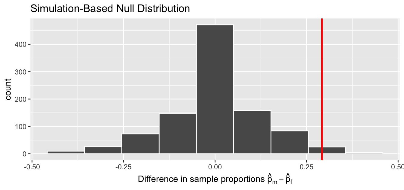
Figure 7.6: Null distribution and observed test statistic.
Sixth, the \(p\)-value is the probability of obtaining a test statistic just as extreme or more extreme than the observed test statistic assuming the null hypothesis \(H_0\) is true. Double ooof! Let’s unpack this slowly as well. You can think of the \(p\)-value as a quantification of “surprise”: assuming \(H_0\) is true, how surprised are we with what we observed? Or in our case, in our hypothesized universe of no gender discrimination, how surprised are we that we observed a difference in promotion rates of 0.292 from our collected samples assuming \(H_0\) is true? Very surprised? Somewhat surprised?
The \(p\)-value quantifies this probability, or in the case of our 1000 differences in sample proportions in Figure 7.6, what proportion had a more “extreme” result? Here, extreme is defined in terms of the alternative hypothesis \(H_A\) that “male” applicants are promoted at a higher rate than “female” applicants. In other words, how often was the discrimination in favor of men even more pronounced than \(0.875 - 0.583 = 0.292 = 29.2\%\)?
In this case, \(p\) = 0.006. In another word, less than 1% of the times, we obtained a difference in proportion greater than or equal to the observed difference of 0.292 = 29.2%. A very rare outcome! Given the rarity of such a pronounced difference in promotion rates in our hypothesized universe of no gender discrimination, we’re inclined to reject our hypothesized universe. Instead, we favor the hypothesis stating there is discrimination in favor of the “male” applicants. In other words, we reject \(H_0\) in favor of \(H_A\).
We are almost done with the hypothesis test. We have tentatively drawn the conclusion based on the \(p\) value. One question remains: how low does the \(p\) value have to be before we start rejecting the hypothesis? In the previous example, \(p\) = 0.006. But who is to say that it is small enough? In practice, it is commonly recommended to set the significance level of the test beforehand. It is denoted by the Greek letter \(\alpha\) (pronounced “alpha”). This value acts as a cutoff on the \(p\)-value, where if the \(p\)-value falls below \(\alpha\), we would “reject the null hypothesis \(H_0\).”
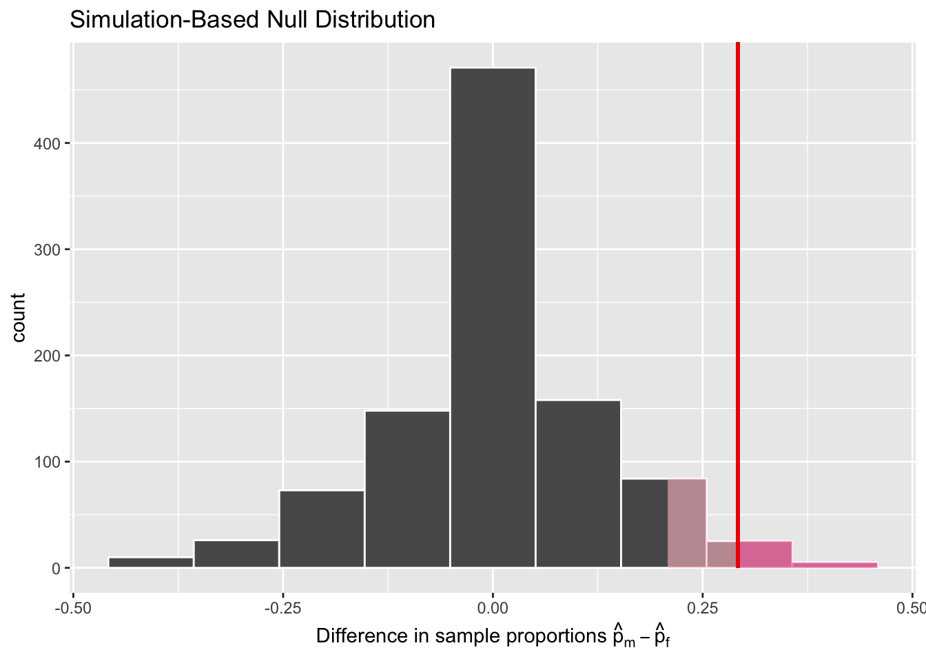
Figure 7.7: significance level (alpha value, light + bright pink region) vs. p value (bright pink region)
Alternatively, if the \(p\)-value does not fall below \(\alpha\), we would “fail to reject \(H_0\).” Note the latter statement is not quite the same as saying we “accept \(H_0\).” This distinction is rather subtle and not immediately obvious. We will revisit it later in Section 7.5.
While different fields tend to use different values of \(\alpha\), some commonly used values for \(\alpha\) are 0.1, 0.05, and 0.01; with 0.05 being the choice people often make without putting much thought into it. In the current example, \(p\) = 0.006. If we choose \(\alpha = 0.05\), \(p\) would fall below \(\alpha\), and we would “reject the null hypothesis \(H_0\).” However, If we choose \(\alpha = 0.001\), \(p\)-value would not not fall below \(\alpha\), and we would “fail to reject \(H_0\).”
7.2.1 Recap
Let’s briefly review what we have just learned.
We formed two competing hypotheses: null hypothesis, alternative hypothesis
We then simulated 1000 experiments results assuming the nulll hypothesis is true, and constructed a distribution of the test statistic from these 1000 results.
And we evaluated the null hypothesis by comparing the observed test statistic to the sampling distribution of the test statistic assuming the null hypothesis is true (aka null distribution)
Then we quantified how surprised we are with what we observed. This value is also known as the \(p\) value.
And finally, we decided that the probability, or the \(p\)-value, is small enough that we will reject the null hypothesis in favour of the alternative hypothesis. We used a cut-off value, 0.05, to make this decision. This cut-off value is also known as the significance level, or alpha level.
We will talk more about \(\alpha\) significance levels
in Section 7.5.
Next, let’s get hands-on and conduct the hypothesis test
corresponding to our promotions activity using the infer package.
7.3 Conducting hypothesis tests
In Section 6.1,
we showed you how to construct confidence intervals
using the infer package workflow.
We did so using function names that are intuitively named with verbs:
specify()the variables of interest in your data frame.generate()replicates of bootstrap resamples with replacement.calculate()the summary statistic of interest.visualize()the resulting bootstrap distribution and confidence interval.
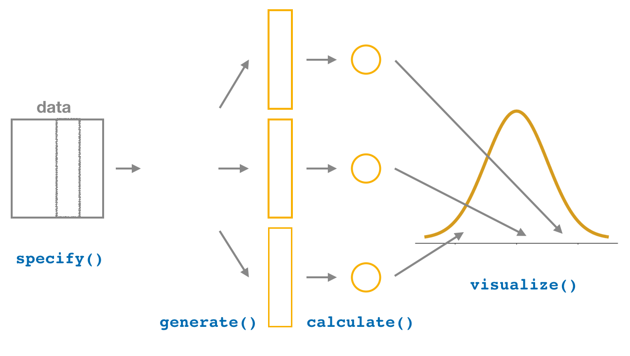
Figure 7.8: Confidence intervals with the infer package.
In this section, we’ll now show you how to seamlessly modify
the infer code for constructing confidence intervals we have seen previously
to conduct hypothesis tests.
You’ll notice that the basic outline of the workflow is almost identical,
except for an additional hypothesize() step
between the specify() and generate() steps,
as can be seen in Figure 7.9.
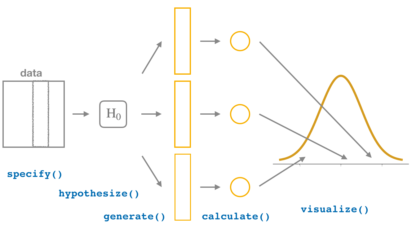
Figure 7.9: Hypothesis testing with the infer package.
Furthermore, we’ll use a pre-specified significance level \(\alpha\) = 0.05 for this hypothesis test. Let’s leave discussion on the choice of this \(\alpha\) value until later on in Section 7.5.
7.3.1 infer package workflow
1. specify variables
In Section 6.7.1,
we used the specify() verb to choose
a single variable in a data frame as the focus of the statistical inference.
With the promotions data frame,
we need to include more than one variable
as the focus of the statistical inference: promotion decision AND gender.
The specify() verb can take multiple variables
expressed in the form of response variable ~ explanatory variable(s).
In this case, since we are interested in any potential effects of gender
on promotion decisions,
we set decision as the response variable
and gender as the explanatory variable.
We do so using formula = response ~ explanatory
where response is the name of the response variable in the data frame
and explanatory is the name of the explanatory variable.
So in our case it is decision ~ gender.
Furthermore, since we are interested in the proportion of résumés "promoted",
and not the proportion of résumés not-promoted,
we set the argument success to "promoted".
Response: decision (factor)
Explanatory: gender (factor)
# A tibble: 48 x 2
decision gender
<fct> <fct>
1 promoted male
2 promoted male
3 promoted male
4 promoted male
5 promoted male
6 promoted male
7 promoted male
8 promoted male
9 promoted male
10 promoted male
# … with 38 more rowsAgain, notice how the promotions data itself doesn’t change,
but the Response: decision (factor) and Explanatory: gender (factor)
meta-data do.
This is similar to how the group_by() verb from dplyr doesn’t change the data,
but only adds “grouping” meta-data, as we saw in Section 3.5.
2. hypothesize the null
In order to conduct hypothesis tests using the infer workflow,
we need a new step not present for confidence intervals:
hypothesize().
Recall from Section 7.2 that our hypothesis test was
\[ \begin{aligned} H_0 &: p_{m} - p_{f} = 0\\ \text{vs. } H_A&: p_{m} - p_{f} > 0 \end{aligned} \]
In other words, the null hypothesis \(H_0\) corresponding
to our “hypothesized universe” stated that there was no difference
in gender-based discrimination rates.
We set this null hypothesis \(H_0\) in our infer workflow
using the null argument of the hypothesize() function to either:
"point"for hypotheses involving a single sample (e.g., Appendix B.1) or"independence"for hypotheses involving two samples.
In our case, since we have two samples
(the résumés with “male” and “female” names), we set null = "independence".
promotions %>%
infer::specify(formula = decision ~ gender, success = "promoted") %>%
infer::hypothesize(null = "independence")Response: decision (factor)
Explanatory: gender (factor)
Null Hypothesis: independence
# A tibble: 48 x 2
decision gender
<fct> <fct>
1 promoted male
2 promoted male
3 promoted male
4 promoted male
5 promoted male
6 promoted male
7 promoted male
8 promoted male
9 promoted male
10 promoted male
# … with 38 more rowsAgain, the data has not changed yet.
This will occur at the upcoming generate() step;
we’re merely setting meta-data for now.
Where do the terms "point" and "independence" come from?
These are two technical statistical terms.
The term “point” relates from the fact that for a single group of observations,
you will test the value of a single point.
Going back to the banana example from Chapter 6,
say we wanted to test wether or not the mean weight of all bananas
was equal to 190 grams.
We would be testing the value of a “point” \(\mu\),
the mean weight of all bananas, as follows
\[ \begin{aligned} H_0 &: \mu = 190\\ \text{vs } H_A&: \mu \neq 190 \end{aligned} \]
The term “independence” relates to the fact that for two groups of observations,
you are testing whether or not the response variable
is independent of the explanatory variable that assigns the groups.
In our case, we are testing whether the decision response variable
is “independent” of the explanatory variable gender
that assigns each résumé to either of the two groups.
For example, if decision is indeed independent from gender,
then gender should have no effect on promotion decision,
and we should expect to see similiar promotion proportions
for both male and female candidates (résumés) in the long run.
Alternatively, in the extremem case,
if decision is entirely tied to to gender,
then gender alone would allow us to predict decision,
and we should expect to see only male or female candidates (résumés)
selected for promotion.
3. generate replicates
After we hypothesize() the null hypothesis,
we generate() replicates of “shuffled” datasets
assuming the null hypothesis is true.
We did this by shuffling a deck of imaginary cards
in Section 7.1.
Instead of using cards,
let’s use a computer algorithm to shuffle 1000 times for us,
by setting reps = 1000
in the generate() function.
However, unlike for confidence intervals where we generated replicates
using type = "bootstrap" resampling with replacement,
we’ll now perform shuffles/permutations by setting type = "permute".
Recall that shuffles/permutations are a kind of resampling,
but unlike the bootstrap method, they involve resampling without replacement.
promotions_generate <- promotions %>%
  infer::specify(formula = decision ~ gender, success = "promoted") %>%
  infer::hypothesize(null = "independence") %>%
  infer::generate(reps = 1000, type = "permute")
nrow(promotions_generate)
[1] 48000Observe that the resulting data frame has
48,000 rows.
This is because we performed shuffles/permutations
for each of the 48 rows 1000 times
and \(48,000 = 1000 \cdot 48\).
If you explore the promotions_generate data frame with View(),
you’ll notice that the variable replicate
indicates which resample each row belongs to.
So it has the value 1 48 times, the value 2 48 times,
all the way through to the value 1000 48 times.
You may be wondering why we chose reps = 1000
for these simulation-based methods.
We have noticed that after around 1000 replicates
for the null distribution and the bootstrap distribution for most problems
you can start to get a general sense for how the statistic behaves.
You can change this value to something like 10,000 though for reps
if you would like even finer detail but this will take more time to compute.
Feel free to iterate on this as you like to get an even better idea
about the shape of the null and bootstrap distributions as you wish.
4. calculate test statistics
Now that we have generated 1000 replicates of “shuffles”
assuming the null hypothesis is true,
let’s calculate() the appropriate summary statistic
for each of our 1000 shuffles.
From Section 7.2,
point estimates related to hypothesis testing have a specific name:
test statistics.
Since the unknown population parameter of interest
is the difference in population proportions \(p_{m} - p_{f}\),
the test statistic here is the difference in sample proportions
\(\widehat{p}_{m} - \widehat{p}_{f}\).
For each of our 1000 shuffles,
we can calculate this test statistic by setting stat = "diff in props".
Furthermore, since we are interested in
\(\widehat{p}_{m} - \widehat{p}_{f}\) we set order = c("male", "female").
As we stated earlier, the order of the subtraction does not matter,
so long as you stay consistent throughout your analysis
and tailor your interpretations accordingly.
Let’s save the result in a data frame called null_distribution:
null_distribution <- promotions %>%
  infer::specify(formula = decision ~ gender, success = "promoted") %>%
  infer::hypothesize(null = "independence") %>%
  infer::generate(reps = 1000, type = "permute") %>%
  infer::calculate(stat = "diff in props", order = c("male", "female"))
null_distribution
# A tibble: 1,000 x 2
replicate stat
* <int> <dbl>
1 1 0.125
2 2 0.125
3 3 0.0417
4 4 0.0417
5 5 0.208
6 6 0.208
7 7 -0.125
8 8 -0.125
9 9 -0.292
10 10 -0.208
# … with 990 more rowsObserve that we have 1000 values of stat,
each representing one instance of \(\widehat{p}_{m} - \widehat{p}_{f}\)
in a hypothesized world of no gender discrimination.
Observe as well that we chose the name of this data frame carefully:
null_distribution.
Recall once again from Section 7.2
that sampling distributions when the null hypothesis \(H_0\)
is assumed to be true have a special name: the null distribution.
What was the observed difference in promotion rates?
In other words, what was the observed test statistic
\(\widehat{p}_{m} - \widehat{p}_{f}\)?
Recall from Section 7.1 that we computed this observed difference
by hand to be 0.875 - 0.583 =
0.292 = 29.2%.
We can also compute this value using the previous infer code
but with the hypothesize() and generate() steps removed.
Let’s save this in obs_diff_prop:
obs_diff_prop <- promotions %>%
  infer::specify(decision ~ gender, success = "promoted") %>%
  infer::calculate(stat = "diff in props", order = c("male", "female"))
obs_diff_prop
# A tibble: 1 x 1
stat
<dbl>
1 0.2925. visualize the p-value
The final step is to measure how surprised we are by a promotion difference of 29.2% in a hypothesized universe of no gender discrimination. If the observed difference of 0.292 is highly unlikely, then we would be inclined to reject the validity of our hypothesized universe.
We start by visualizing the null distribution of our 1000 values
of \(\widehat{p}_{m} - \widehat{p}_{f}\)
using infer::visualize()
in Figure 7.10.
Recall that these are values of the difference in promotion rates
assuming \(H_0\) is true.
This corresponds to being in our hypothesized universe of no gender discrimination.
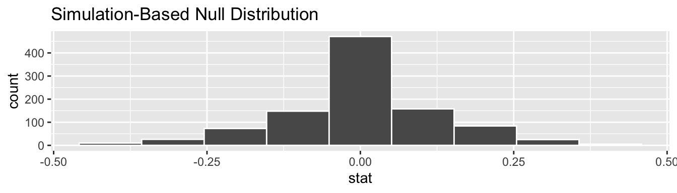
Figure 7.10: Null distribution.
Let’s now add what happened in real life
to Figure 7.10,
the observed difference in promotion rates of
0.875 - 0.583 = 0.292 =
29.2%.
However, instead of merely adding a vertical line using geom_vline(),
let’s use the infer::shade_p_value() function
with obs_stat set to the observed test statistic value
we saved in obs_diff_prop.
Furthermore, we’ll set the direction = "right"
reflecting our alternative hypothesis \(H_A: p_{m} - p_{f} > 0\).
Recall our alternative hypothesis \(H_A\) is that \(p_{m} - p_{f} > 0\),
stating that there is a difference in promotion rates
in favor of résumés with male names.
“More extreme” here corresponds to differences that are “bigger”
or “more positive” or “more to the right.”
Hence we set the direction argument of shade_p_value() to be "right".
On the other hand,
had our alternative hypothesis \(H_A\) been the other possible
one-sided alternative \(p_{m} - p_{f} < 0\),
suggesting discrimination in favor of résumés with female names,
we would’ve set direction = "left".
Had our alternative hypothesis \(H_A\) been two-sided \(p_{m} - p_{f} \neq 0\),
suggesting discrimination in either direction,
we would’ve set direction = "both".
infer::visualize(null_distribution, bins = 10) +
  infer::shade_p_value(obs_stat = obs_diff_prop, direction = "right")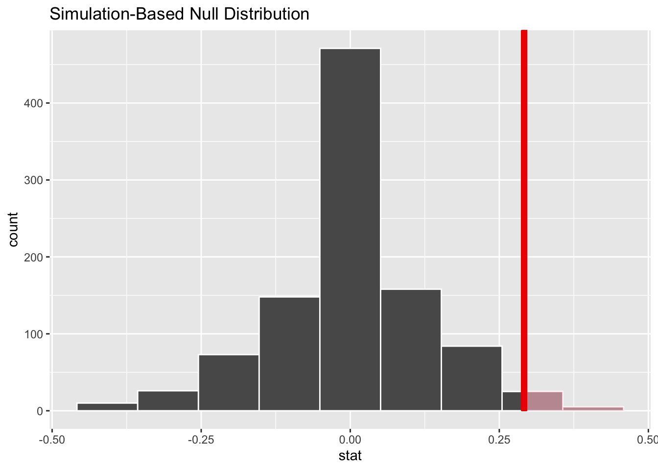
Figure 7.11: Shaded histogram to show \(p\)-value.
In the resulting Figure 7.11, the solid dark line marks 0.292 = 29.2%. However, what does the shaded-region correspond to? This is the \(p\)-value. Recall the definition of the \(p\)-value from Section 7.2:
A \(p\)-value is the probability of obtaining a test statistic just as or more extreme than the observed test statistic assuming the null hypothesis \(H_0\) is true.
So judging by the shaded region in Figure 7.11, it seems we would somewhat rarely observe differences in promotion rates of 0.292 = 29.2% or more in a hypothesized universe of no gender discrimination. In other words, the \(p\)-value is somewhat small. Hence, we would be inclined to reject this hypothesized universe, or using statistical language we would “reject \(H_0\).”
What fraction of the null distribution is shaded?
In other words, what is the exact value of the \(p\)-value?
We can compute it using the get_p_value() function
with the same arguments as the previous shade_p_value() code:
# A tibble: 1 x 1
  p_value
    <dbl>
1    0.03
Keeping the definition of a \(p\)-value in mind, the probability of observing a difference in promotion rates as large as 0.292 = 29.2% due to sampling variation alone in the null distribution is 0.03 = 3%. Since this \(p\)-value is smaller than our pre-specified significance level \(\alpha\) = 0.05, we reject the null hypothesis \(H_0: p_{m} - p_{f} = 0\). In other words, this \(p\)-value is sufficiently small to reject our hypothesized universe of no gender discrimination. We instead have enough evidence to change our mind in favor of gender discrimination being a likely culprit here. Observe that whether we reject the null hypothesis \(H_0\) or not depends in large part on our choice of significance level \(\alpha\). We’ll discuss this more in Subsection 7.5.3.
7.3.2 Comparison with confidence intervals
One of the great advantages of the infer package is
that we can jump seamlessly between conducting hypothesis tests
and constructing confidence intervals with minimal changes!
Recall the code from the previous section that creates the null distribution,
which in turn is needed to compute the \(p\)-value:
null_distribution <- promotions %>%
  infer::specify(formula = decision ~ gender, success = "promoted") %>%
  infer::hypothesize(null = "independence") %>%
  infer::generate(reps = 1000, type = "permute") %>%
  infer::calculate(stat = "diff in props", order = c("male", "female"))
To create the corresponding bootstrap distribution
needed to construct a 95% confidence interval for \(p_{m} - p_{f}\),
we only need to make two changes.
First, we remove the hypothesize() step
since we are no longer assuming a null hypothesis \(H_0\) is true.
We can do this by deleting or commenting out the hypothesize() line of code.
Second, we switch the type of resampling in the generate() step
to be "bootstrap" instead of "permute".
bootstrap_distribution <- promotions %>%
  infer::specify(formula = decision ~ gender, success = "promoted") %>%
  # Change 1 - Remove hypothesize():
  # hypothesize(null = "independence") %>%
  # Change 2 - Switch type from "permute" to "bootstrap":
  infer::generate(reps = 1000, type = "bootstrap") %>%
  infer::calculate(stat = "diff in props", order = c("male", "female"))
Using this bootstrap_distribution,
let’s first compute the percentile-based confidence intervals,
as we did in Section 6.1:
percentile_ci <- bootstrap_distribution %>%
  infer::get_confidence_interval(level = 0.95, type = "percentile")
percentile_ci
# A tibble: 1 x 2
lower_ci upper_ci
<dbl> <dbl>
1 0.0626 0.532Using our shorthand interpretation for 95% confidence intervals
from Subsection 6.6.2,
we are 95% “confident” that the true difference in population proportions
\(p_{m} - p_{f}\) is between [0.063,
0.532].
Let’s visualize bootstrap_distribution
and this percentile-based 95% confidence interval for \(p_{m} - p_{f}\)
in Figure 7.12.
infer::visualize(bootstrap_distribution) +
  infer::shade_confidence_interval(endpoints = percentile_ci)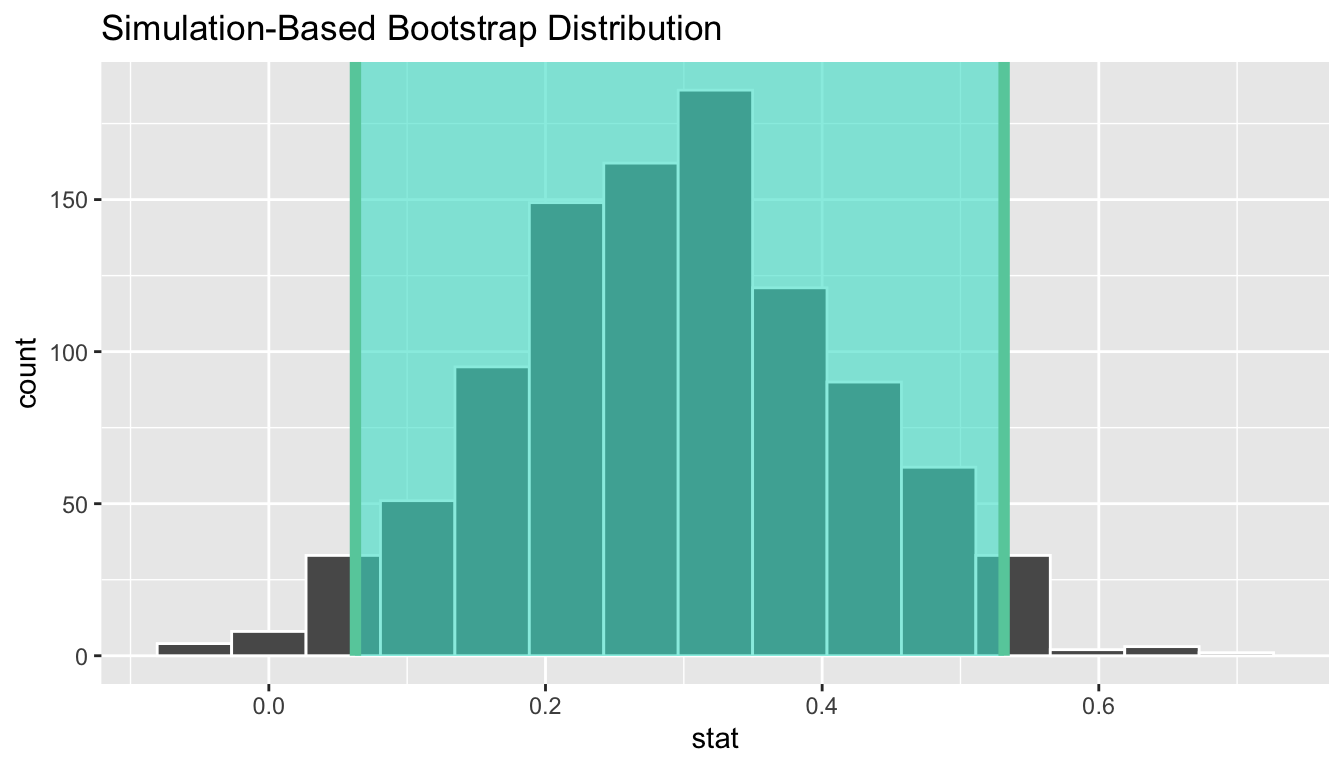
Figure 7.12: Percentile-based 95% confidence interval.
Notice a key value that is not included in the 95% confidence interval for \(p_{m} - p_{f}\): the value 0. In other words, a difference of 0 is not included in our net, suggesting that the population parameter \(p_{m} - p_{f}\) is unlikely to be zero, or that \(p_{m}\) and \(p_{f}\) are truly different! Furthermore, observe how the entirety of the 95% confidence interval for \(p_{m} - p_{f}\) lies above 0, suggesting that this difference is in favor of men. In plain English, male candidates are more likely to be promoted than their female counterparts. Recall that this is the same conclusion we drew in Section 7.2, based on the fact that the \(p\) value fell below the pre-defined \(\alpha\) level. This is not a coincidence. Statistical inferences via confidence intervals or via \(p\) values are two complementary approaches. We will revisit this point in subsequent chapters.
Since the bootstrap distribution appears to be roughly normally shaped,
we can also use the standard error method
as we did in Section 6.1.
In this case, we must specify the point_estimate argument
as the observed difference in promotion rates
0.292 = 29.2%
saved in obs_diff_prop.
This value acts as the center of the confidence interval.
se_ci <- bootstrap_distribution %>%
  infer::get_confidence_interval(level = 0.95, type = "se",
                                 point_estimate = obs_diff_prop)
se_ci
# A tibble: 1 x 2
lower_ci upper_ci
<dbl> <dbl>
1 0.0539 0.529Let’s visualize bootstrap_distribution again,
but now the standard error based 95% confidence interval for \(p_{m} - p_{f}\)
in Figure 7.13.
Again, notice how the value 0 is not included in our confidence interval,
suggesting that \(p_{m}\) and \(p_{f}\) are truly different!
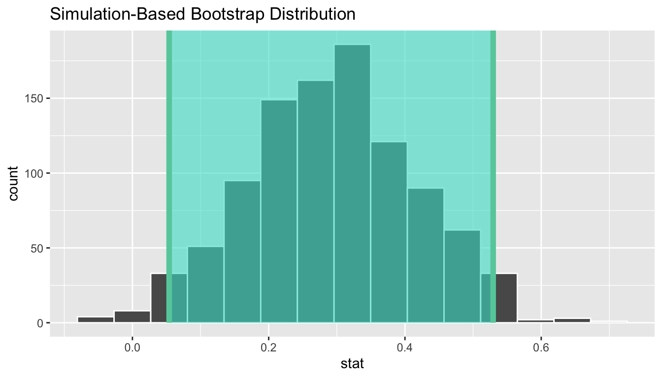
Figure 7.13: Standard error-based 95% confidence interval.
7.3.3 “There is only one test”
Let’s recap the steps necessary to conduct a hypothesis test
using the terminology, notation, and definitions related to sampling
you saw in Section 7.2
and the infer workflow from Subsection 7.3.1:
specify()the variables of interest in your data frame.hypothesize()the null hypothesis \(H_0\). In other words, set a “model for the universe” assuming \(H_0\) is true.generate()shuffles assuming \(H_0\) is true. In other words, simulate data assuming \(H_0\) is true.calculate()the test statistic of interest, both for the observed data and your simulated data.visualize()the resulting null distribution and compute the \(p\)-value by comparing the null distribution to the observed test statistic.
While this is a lot to digest, especially the first time you encounter hypothesis testing, the nice thing is that once you understand this general framework, then you can understand any hypothesis test. In a famous blog post, computer scientist Allen Downey called this the “There is only one test” framework, for which he created the flowchart displayed in Figure 7.14.
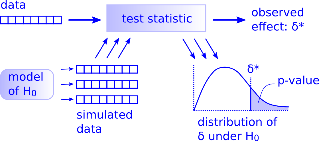
Figure 7.14: Allen Downey’s hypothesis testing framework.
Notice its similarity with the “hypothesis testing with infer” diagram
you saw in Figure 7.9.
That’s because the infer package was explicitly designed
to match the “There is only one test” framework.
So if you can understand the framework,
you can easily generalize these ideas for all hypothesis testing scenarios
(Section 7.6.3).
Whether for population proportions \(p\),
population means \(\mu\),
differences in population proportions \(p_1 - p_2\),
differences in population means \(\mu_1 - \mu_2\),
and as you’ll see in Chapter 12
on inference for regression, population regression slopes \(\beta_1\) as well.
In fact, it applies more generally
to more complicated hypothesis tests and test statistics as well.
7.4 Theory-based hypothesis tests
Much as we did in Section 6.2 when we showed you a theory-based method for constructing confidence intervals that involved mathematical formulas, we now discuss an example of a traditional theory-based method to conduct hypothesis tests. This method relies on probability models, probability distributions, and a few assumptions to construct the null distribution. This is in contrast to the approach we have been using throughout this book where we relied on computer simulations to construct the null distribution.
These traditional theory-based methods have been used for decades mostly because researchers did not have access to computers that could run thousands of calculations quickly and efficiently. Now that computing power is much cheaper and more accessible, simulation-based methods are much more feasible. However, researchers in many fields continue to use theory-based methods. Hence, it is important to understand them and being able to use them.
Recall that the test statistic we used in Section 7.3 for the simulation-based method was the difference in sample proportions \(\hat{p}_m - \hat{p}_f\). Its observed value from the original sample, 29.2%, was deemed untypically large compared to the majority of simulated-results under the null hypothesis (Figure 7.11). For the theory-based method, however, we will use a different test statistic. Instead of using the raw difference in sample proportions, we will first convert it to \(z\)-statistic, which will then be compared to numbers from a “\(z\)-distribution.”
7.4.1 \(z\)-statistic
A common task in statistics is the process of “standardizing a variable.” By standardizing different variables, we make them more comparable. For example, say you are interested in studying the distribution of temperature recordings from Portland, Oregon, USA and comparing it to that of the temperature recordings in Ottawa, Ontario, Canada. Given that US temperatures are generally recorded in degrees Fahrenheit and Canadian temperatures are generally recorded in degrees Celsius, how can we make them comparable? One approach would be to convert degrees Fahrenheit into Celsius, or vice versa. Another approach would be to convert them both to a common “standardized” scale, such as degrees Kelvin.
One common method for standardizing a variable from probability and statistics theory is to compute the \(z\)-statistic:
\[ z = \frac{x - \mu}{\sigma} \tag{7.1} \]
where \(x\) represents one value of a variable, \(\mu\) represents the mean of that variable, and \(\sigma\) represents the standard deviation of that variable. You first subtract the mean \(\mu\) from each value of \(x\) and then divide \(x - \mu\) by the standard deviation \(\sigma\). These operations will have the effect of re-centering your variable around 0 and re-scaling your variable \(x\) so that they have what are known as “standard units.” Thus for every value that your variable can take, it has a corresponding \(z\)-score that gives how many standard units away that value is from the mean \(\mu\).
Bringing these back to the difference of sample proportions \(\hat{p}_m - \hat{x}_f\), how would we standardize this variable? By once again subtracting its mean and dividing by its standard deviation. Applying these ideas, we present the \(z\)-statistic:
\[ z = \dfrac{ (\hat{p}_m - \hat{p}_f) - ({p}_m - {p}_f) } {\text{SE}_{\hat{p}_m - \hat{p}_f}} = \dfrac{ (\hat{p}_m - \hat{p}_f) - ({p}_m - {p}_f)} {\sqrt{\dfrac{\hat{p}(1 - \hat{p})}{n_m} + \dfrac{\hat{p}(1 - \hat{p})}{n_f} }} \tag{7.2} \]
where \(\hat{p} = \dfrac{\text{total number of promoted} }{ \text{total number of résumé}}.\)
Oofda! There is a lot to try to unpack here! Let’s go slowly. In the numerator, \(\hat{p}_m - \hat{p}_f\) is the difference in sample proportions between male and female, while \({p}_m - {p}_f\) is the difference in population proportions. In the denominator, \(\text{SE}_{\hat{p}_m - \hat{p}_f}\) is the standard deviations of the sampling distribution, or the standard error (Chapter 5). Lastly, \(n_m\) and \(n_f\) are the sample sizes of the “male candidates” and “female candidates.”
Observe that the formula for \(\text{SE}_{\bar{x}_a - \bar{x}_r}\) has the sample sizes \(n_m\) and \(n_f\) in them. So as the sample sizes increase, the standard error goes down. We have seen this concept before in Chapter 6, where we studied the effect of using different sample sizes on the widths of confidence intervals.
So how can we use the \(z\)-statistic as a test statistic in our hypothesis test? Assuming the null hypothesis \(H_0: {p}_m - {p}_f = 0\) is true, the right-hand side of the numerator (to the right of the \(-\) sign), \({p}_m - {p}_f\), becomes 0. Equation (7.2) can be simplified as:
\[ z = \dfrac{ (\hat{p}_m - \hat{p}_f) - ({p}_m - {p}_f) } {\text{SE}_{\hat{p}_m - \hat{p}_f}} = \dfrac{ (\hat{p}_m - \hat{p}_f) - 0} {\sqrt{\dfrac{\hat{p}(1 - \hat{p})}{n_m} + \dfrac{\hat{p}(1 - \hat{p})}{n_f} }} \tag{7.3} \]
We could substitute each variable in Equation (7.3)
with the actual value based on the sample
to calculate the observed \(z\)-score.
For example, \(\hat{p}_m = 21/24=0.75\).
Alternatively,
we could directly calculate the observed \(z\)-score using infer verbs.
Let’s proceed with the second approach.
z_score <- promotions %>%
  infer::specify(formula = decision ~ gender, success = "promoted") %>%
  # we do not need the `hypothesize` or `generate` verbs this time
  # Notice we switched `stat` from "diff in prop" to "z"
  infer::calculate(stat = "z", order = c("male", "female")) %>%
  dp$pull(stat) %>%
  round(3)
z_score
[1] 2.274Therefore,
\[ z_{obs} = \dfrac{ (\hat{p}_m - \hat{p}_f) - 0}{\sqrt{\dfrac{\hat{p}(1 - \hat{p})}{n_m} + \dfrac{\hat{p}(1 - \hat{p})}{n_f} }} = 2.274 \tag{7.4} \]
Great! Next, we need to compare this observed \(z\)-score to values that consist a null distribution, just like what we did in Section 7.3.1, where the observed difference in promotion rates, 29.2%, was compared to a null distribution made of simulated result. let’s construct the thoery-based null distribution now.
7.4.2 Null distribution
Let’s revisit the null distribution for the test statistics \(\hat{p}_m - \hat{p}_f\) we constructed using shuffling/permutation in Figure 7.10.
# Construct null distribution of p_hat_m - p_hat_f
null_distribution <- promotions %>%
  infer::specify(formula = decision ~ gender, success = "promoted") %>%
  infer::hypothesize(null = "independence") %>%
  infer::generate(reps = 1000, type = "permute") %>%
  infer::calculate(stat = "diff in props", order = c("male", "female"))
infer::visualize(null_distribution, bins = 10)
I have reproduced it in Figure 7.15 Panel A. As we discussed in Section 7.2, this null distribution is essentially a sampling distribution of the test statistic \(\hat{p}_m - \hat{p}_f\) under the null hypothesis.
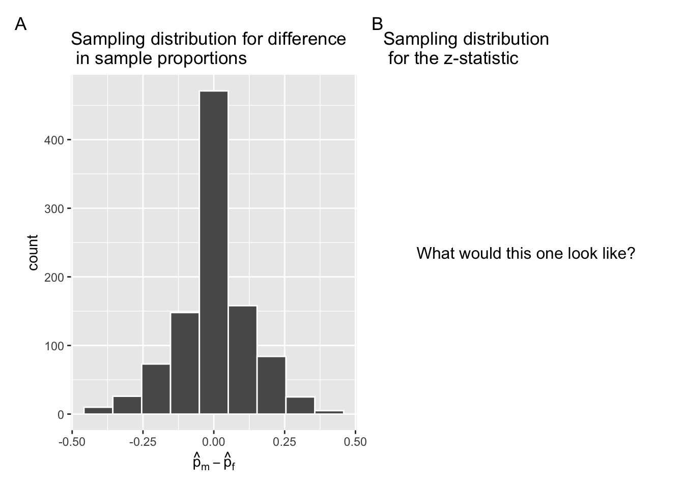
Figure 7.15: Comparing the null distributions of two test statistics.
For the theory-based method, we need to construct a sampling distribution of the \(z\)-statistic (Equation (7.3)) under the null hypothesis. Similar to how the Central Limit Theorem from Chapter 5 states that the sampling distribution of mean follows a normal distribution, it can be mathematically proven that the \(z\)-statistic in Equation (7.3) follows a standard normal \(z\)-curve, with \(\mu = 0\) and \(\sigma = 1\). Let’s express this new information in Equation (7.5).
\[ z = \dfrac{ (\hat{p}_m - \hat{p}_f) - 0} {\sqrt{\dfrac{\hat{p}(1 - \hat{p})}{n_m} + \dfrac{\hat{p}(1 - \hat{p})}{n_f} }} \sim N(0,1) \tag{7.5} \]
The infer package can generate and visualize null distribution
for \(z\)-statistic as well,
as shown in Figure 7.16 Panel B,
next to the simulation-based null distribution in Panel A.
# Construct null distribution of z:
null_distribution_promotions_z <- promotions %>%
  infer::specify(formula = decision ~ gender, success = "promoted") %>%
  infer::hypothesize(null = "independence") %>%
  infer::generate(reps = 1000, type = "permute") %>%
  # Notice we switched `stat` from "diff in prop" to "z"
  infer::calculate(stat = "z", order = c("male", "female"))
# Visualize the theoretical null distribution, notice `method = "theoretical"`
infer::visualize(null_distribution_promotions_z, bins = 10, method = "theoretical")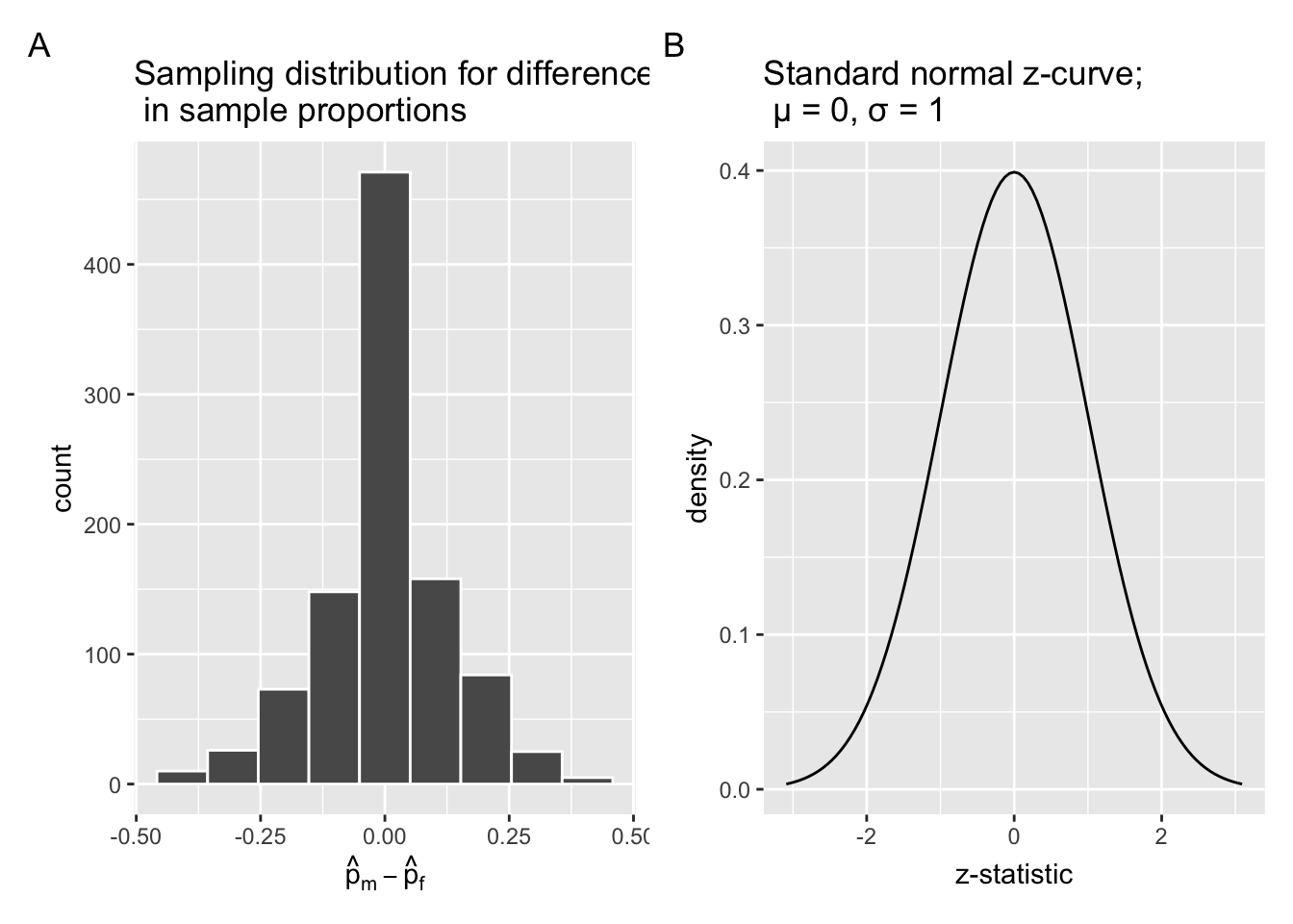
Figure 7.16: Comparing the null distributions of two test statistics.
Observe that while the shape of the null distributions in Figure 7.16 are similar, the scales on the x-axis are different. In Panel A, the scale of the x-axis is the actual difference in promotion rates between male and female in percentages, \(\hat{p}_m - \hat{p}_f\), ranging from \(-100%\) to \(100%\). In Panel B, the scale of the x-axis is the \(z\)-statistic, each unit representing one standard deviation on the standard normal curve. And the x-axis technically ranges from \(-\infty\) to \(+\infty\),
Next, let’s mark the observed difference in promotion rates, 29.2%, on the simulation-based null distribution in Panel A of Figure 7.16, as we saw in Section 7.1.4. Likewise, let’s mark the observed \(z\)-score on the standard normal curve in Panel B of Figure 7.16. Both of them are shown in Figure 7.17. Now, ask yourself, how does the observed \(z\)-score, 2.274, fare compared to the rest of values on the \(z\)-curve?
null_dist_1 <- infer::visualize(null_distribution, bins = 10) +
  infer::shade_p_value(obs_stat = obs_diff_prop,
                       direction = "right",
                       fill = c("hotpink"),
                       size = 1)

null_dist_2 <- infer::visualize(null_distribution_promotions_z,
                                bins = 10,
                                method = "theoretical") +
  infer::shade_p_value(obs_stat = z_score,
                       direction = "right",
                       fill = c("hotpink"),
                       size = 1)

null_dist_1 + null_dist_2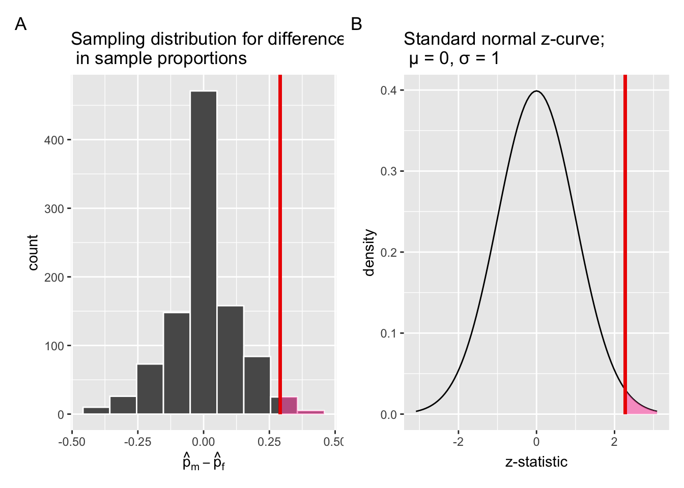
Figure 7.17: Comparing the null distributions of two test statistics.
When you run the code above,
you will receive a Warning message in the console.
We will discuss it shortly.
Let’s focus on the figures first.
In Section 7.3.1, we explained that the area under the null distribution at or “more extreme” than the observed test statistic, or the shaded region, represents the \(p\)-value of the shuffling/permutation based hypothesis test. Similarly, the shaded region under the \(z\)-curve in Panel B of Figure 7.17 represents the \(p\)-value of the theory-based hypothesis test. Not surprisingly, the shared regions in both Panel A and B appear to be similar in size, indicating that both methods would result in similar \(p\)-values. In addition, both vertical lines are positioned similarly relative to the centre of the respective null distribution.
To calculate the \(p\)-value of the theory-based hypothesis test,
let’s use pnorm(), a base-R function.
pnorm(z_score, lower.tail = FALSE) %>% round(3)
# lower.tail: logical; if TRUE (default),
# probabilities are P[X ≤ x] otherwise, P[X > x].
[1] 0.011This \(p\)-value from the theory-based method, 0.011, is of the same order of magnitude as the one we obtained earlier using the simulated-based method in Section 7.3.1, 0.03. In other words, both methods led to highly similar results for the current dataset. Recall that we had set the significance level of the test or \(\alpha\) to 0.05. Given that the \(p\)-value = 0.011 falls below \(\alpha\) , it is very unlikely that these results are due to sampling variation. Thus, we are inclined to reject \(H_0\).
Let’s turn our attention to the warning now.
7.4.3 Assumptions
Let’s come back to that earlier warning message:
Check to make sure the conditions have been met for the theoretical method. {infer} currently does not check these for you.
To be able to use the \(z\)-test and other such theoretical methods,
there are always a few conditions to meet.
Most of the statistical software do not automatically check these conditions,
hence the need for due diligence.
These conditions are necessary so that the underlying mathematical theory holds.
In order for the results of our \(z\)-test to be valid,
three conditions must be met:
Sample size: The number of expected promoted and expected un-promoted must be at least 53 for each group.
We need to first figure out the overall (pooled) promotion rate:
\[\hat{p}_{obs} = \dfrac{21 + 14}{48} = \dfrac{35}{48} = 0.729\]
The overall (pooled) un-promotion rate:
\[\hat{q}_{obs} = 1 - p = 0.271\]
We now determine expected promotion and un-promotion counts:
\(p \cdot n_m = 0.729 \cdot 48 = 34.992 \approx 35\)
\(p \cdot n_f = 0.729 \cdot 48 = 34.992 \approx 35\)
\(q \cdot n_m = q \cdot n_f = 0.271 \cdot 48 = 13.008 \approx 13\),
\(q \cdot n_f = 0.271 \cdot 48 = 13.008 \approx 13\),
Note that \(n_m = n_f = 48\) is a special case in this example.
All four counts have exceeded 5, thus meeting the first condition.
Independent selection of samples: The cases are not paired in any meaningful way.
We have no reason to suspect that a decision to promote a “female candidate” has any influence on a decision to promote a “male candidate,” given that t hey were made by different people.
Independent observations: Each case that was selected must be independent of all the other cases selected.
This condition is met since each decision was made independently by a participant, and all participants were chosen at random.
Assuming all three conditions are roughly met, we can be reasonably certain that the theory-based \(z\)-test results are valid. If any of the conditions were clearly not met, we could not put as much trust into any conclusions reached. On the other hand, in most scenarios, the only assumption that needs to be met in the simulation-based method is that the sample is selected at random. Thus, simulation-based methods are preferable as they have fewer assumptions, are conceptually easier to understand, and since computing power has recently become easily accessible, they can be run quickly. That being said, given that much of the world’s research still relies on traditional theory-based methods, it is important to understand them.
7.4.4 Conducting a \(z\)-test using base-R functions
So far, we have focused on the ins and outs of the theory-based \(z\)-test,
using various verbs from the infer package.
Next, let’s reap the benefit of our improved understanding of this techique
and conduct a theory-based \(z\)-test.
Normally, we would start by checking whether the dataset at hand has met all the assumptions required by the intended test, i.e., \(z\)-test. As we have already completed this step in Section 7.4.3, and confirmed that the current dataset met all three conditions resonably well, let’s proceed to the next stage.
Although infer offers a great selection of functions,
it is mainly built for conducting simulation-based inferences.
For example, the infer::get_p_value() function
would not provide an acurate \(p\)-value for theory-based \(z\)-tests.
To test proportion differences between groups using a thoery-based method,
we can use the function prop.test() from the stats package,
which comes with every clean install of R.
The function prop.test() takes several input, including:
n- a vector of group sizes In the current context,nis a vector of counts of cadidates (résumés) in each gender group.x- a vector of counts of successes In the current context,xis a vector of counts for candidates (résumés) who are promoted in each gender group.alternative- a character string specifying the alternative hypothesis. In our case, we are testing a one-sided question — whether male canadidates were more likely promoted than female cadidates, soalternativeis equal togreater.correct- a logical indication whether a correction should be made if the sample size assumption has been violated. We can set this parameter toFALSEas it has been confirmed in Section 7.4.3.
We could manually calculate both n and x
given that the current dataset promotions has a manageable size.
Nevertheless, I will demonstrate how to use R to do all the grunt work,
should you need to deal with a larger dataset in the future.
n_male <- promotions %>%
  dp$filter(gender == "male") %>%
  nrow()
n_female <- promotions %>%
  dp$filter(gender == "female") %>%
  nrow()
n_male_promoted <- promotions %>%
  dp$filter(gender == "male" & decision == "promoted") %>%
  nrow()
n_female_promoted <- promotions %>%
  dp$filter(gender == "female" & decision == "promoted") %>%
  nrow()
Now we are ready to use the prop.test().
stats::prop.test(x = c(n_male_promoted, n_female_promoted),
                 n = c(n_male, n_female),
                 alternative = "greater",
                 correct = FALSE
       )
    2-sample test for equality of proportions without continuity
    correction

data:  c(n_male_promoted, n_female_promoted) out of c(n_male, n_female)
X-squared = 5.1692, df = 1, p-value = 0.0115
alternative hypothesis: greater
95 percent confidence interval:
 0.09234321 1.00000000
sample estimates:
   prop 1    prop 2
0.8750000 0.5833333
Although prop.test did a \(\chi^2\) test (pronounced “kahy”-sqaured test),
it is mathematically equivalent to a \(z\)-test in this case.
For example, the \(p\)-value from line 6 of the output above,
0.011, is identical to what we have obtained
from Section 7.4.2.
In fact, the square of the test statistic for the \(z\)-test,
\(z^2 = 2.274^2 = 5.17\),
is identical to the \(\chi^2\) test statistic from line 6 of the output above,
5.17.
The \(p\)-value—the probability of observing a \(\chi^2\) value of 5.17 or more extreme under the null distribution—is 0.011. Similar to the simulation based approach, we can say that less than 2% of the times, we would obtain a difference in proportion greater than or equal to the observed difference of 0.292 = 29.2%. If we choose \(\alpha = 0.05\), \(p\) would fall below \(\alpha\), and we would reject the null hypothesis \(H_0\) — the hypothesized universe of no gender discrimination. Instead, we favor the hypothesis stating there is discrimination in favor of the male applicants (résumés).
7.5 Interpreting hypothesis tests
Interpreting the results of hypothesis tests is one of the more challenging aspects of this method for statistical inference. In this section, we’ll focus on ways to help with deciphering the process and address some common misconceptions.
7.5.1 Fail to reject ≠ Accept
In Section 7.2, we mentioned that given a pre-specified significance level \(\alpha\) there are two possible outcomes of a hypothesis test:
- If the \(p\)-value is less than \(\alpha\), then we reject the null hypothesis \(H_0\) in favor of \(H_A\).
- If the \(p\)-value is greater than or equal to \(\alpha\), we fail to reject the null hypothesis \(H_0\).
Unfortunately, the latter result is often misinterpreted as “accepting the null hypothesis \(H_0\).” While at first glance it may seem that the statements “failing to reject \(H_0\)” and “accepting \(H_0\)” are equivalent, there actually is a subtle difference. Saying that we “accept the null hypothesis \(H_0\)” is equivalent to stating that “we think the null hypothesis \(H_0\) is true.” However, saying that we “fail to reject the null hypothesis \(H_0\)” is saying something else: “While \(H_0\) might still be false, we don’t have enough evidence to say so.” In other words, there is an absence of enough proof. However, the absence of proof is not proof of absence.
To further shed light on this distinction, let’s use the United States criminal justice system as an analogy. A criminal trial in the United States is a similar situation to hypothesis tests whereby a choice between two contradictory claims must be made about a defendant who is on trial:
- The defendant is truly either “innocent” or “guilty.”
- The defendant is presumed “innocent until proven guilty.”
- The defendant is found guilty only if there is strong evidence that the defendant is guilty. The phrase “beyond a reasonable doubt” is often used as a guideline for determining a cutoff for when enough evidence exists to find the defendant guilty.
- The defendant is found to be either “not guilty” or “guilty” in the ultimate verdict.
In other words, not guilty verdicts are not suggesting the defendant is innocent, but instead that “while the defendant may still actually be guilty, there wasn’t enough evidence to prove this fact.” Now let’s make the connection with hypothesis tests:
- Either the null hypothesis \(H_0\) or the alternative hypothesis \(H_A\) is true.
- Hypothesis tests are conducted assuming the null hypothesis \(H_0\) is true.
- We reject the null hypothesis \(H_0\) in favor of \(H_A\) only if the evidence found in the sample suggests that \(H_A\) is true. The significance level \(\alpha\) is used as a guideline to set the threshold on just how strong of evidence we require.
- We ultimately decide to either “fail to reject \(H_0\)” or “reject \(H_0\).”
So while gut instinct may suggest “failing to reject \(H_0\)” and “accepting \(H_0\)” are equivalent statements, they are not. “Accepting \(H_0\)” is equivalent to finding a defendant innocent. However, courts do not find defendants “innocent,” but rather they find them “not guilty.” Putting things differently, defense attorneys do not need to prove that their clients are innocent, rather they only need to prove that clients are not “guilty beyond a reasonable doubt.”
So going back to our résumés activity in Section 7.3, recall that our hypothesis test was \(H_0: p_{m} - p_{f} = 0\) versus \(H_A: p_{m} - p_{f} > 0\) and that we used a pre-specified significance level of \(\alpha\) = 0.05. We found a \(p\)-value of 0.03. Since the \(p\)-value was smaller than \(\alpha\) = 0.05, we rejected \(H_0\). In other words, we found needed levels of evidence in this particular sample to say that \(H_0\) is false at the \(\alpha\) = 0.05 significance level. We also state this conclusion using non-statistical language: we found enough evidence in this data to suggest that there was gender discrimination at play.
7.5.2 Types of errors
Unfortunately, there is some chance a jury or a judge can make an incorrect decision in a criminal trial by reaching the wrong verdict. For example, finding a truly innocent defendant “guilty.” Or on the other hand, finding a truly guilty defendant “not guilty.” This can often stem from the fact that prosecutors don’t have access to all the relevant evidence, but instead are limited to whatever evidence the police can find.
The same holds for hypothesis tests. We can make incorrect decisions about a population parameter because we only have a sample of data from the population and thus sampling variation can lead us to incorrect conclusions.
There are two possible erroneous conclusions in a criminal trial: either (1) a truly innocent person is found guilty or (2) a truly guilty person is found not guilty. Similarly, there are two possible errors in a hypothesis test: either (1) rejecting \(H_0\) when in fact \(H_0\) is true, called a Type I error or (2) failing to reject \(H_0\) when in fact \(H_0\) is false, called a Type II error. Another term used for “Type I error” is “false positive,” while another term for “Type II error” is “false negative.”
This risk of error is the price researchers pay for basing inference on a sample instead of performing a census on the entire population. But as we’ve seen in our numerous examples and activities so far, censuses are often very expensive and other times impossible, and thus researchers have no choice but to use a sample. Thus in any hypothesis test based on a sample, we have no choice but to tolerate some chance that a Type I error will be made and some chance that a Type II error will occur.
To help understand the concepts of Type I error and Type II errors, we apply these terms to our criminal justice analogy in the following table.
| Truth | ||
|---|---|---|
| Truly not guilty | Truly guilty | |
| Verdict | ||
| Not guilty verdict | Correct | Type II error |
| Guilty verdict | Type I error | Correct |
Thus a Type I error corresponds to incorrectly putting a truly innocent person in jail, whereas a Type II error corresponds to letting a truly guilty person go free. Let’s show the corresponding table in the following table for hypothesis tests.
| Truth | ||
|---|---|---|
| $$H_0 \text{ true}$$ | $$H_A \text{ true}$$ | |
| Verdict | ||
| $$\text{Fail to reject } H_0$$ | Correct | Type II error |
| $$\text{Reject } H_0$$ | Type I error | Correct |
7.5.3 How do we choose alpha?
If we are using a sample to make inferences about a population, we run the risk of making errors. For confidence intervals, a corresponding “error” would be constructing a confidence interval that does not contain the true value of the population parameter. For hypothesis tests, this would be making either a Type I or Type II error. Obviously, we want to minimize the probability of either error; we want a small probability of making an incorrect conclusion:
The probability of a Type I Error occurring is denoted by \(\alpha\). The value of \(\alpha\) is called the significance level of the hypothesis test, which we defined in Section 7.2.
The probability of a Type II Error is denoted by \(\beta\). The value of \(1-\beta\) is known as the power of the hypothesis test.
In other words, \(\alpha\) corresponds to the probability of incorrectly rejecting \(H_0\) when in fact \(H_0\) is true. On the other hand, \(\beta\) corresponds to the probability of incorrectly failing to reject \(H_0\) when in fact \(H_0\) is false.
Ideally, we want \(\alpha = 0\) and \(\beta = 0\), meaning that the chance of making either error is 0. However, this can never be the case in any situation where we are sampling for inference. There will always be the possibility of making either error when we use sample data. Furthermore, these two error probabilities are inversely related. As the probability of a Type I error goes down, the probability of a Type II error goes up.
What is typically done in practice is to fix the probability of a Type I error by pre-specifying a significance level \(\alpha\) and then try to minimize \(\beta\). In other words, we will tolerate a certain fraction of incorrect rejections of the null hypothesis \(H_0\), and then try to minimize the fraction of incorrect non-rejections of \(H_0\).
So for example if we used \(\alpha\) = 0.01, we would be using a hypothesis testing procedure that in the long run would incorrectly reject the null hypothesis \(H_0\) one percent of the time. This is analogous to setting the confidence level of a confidence interval.
So what value should you use for \(\alpha\)? Different fields have different conventions, but some commonly used values include 0.10, 0.05, 0.01, and 0.001. However, it is important to keep in mind that if you use a relatively small value of \(\alpha\), then all things being equal, \(p\)-values will have a harder time being less than \(\alpha\). Thus we would reject the null hypothesis less often. In other words, we would reject the null hypothesis \(H_0\) only if we have very strong evidence to do so. This is known as a “conservative” test.
On the other hand, if we used a relatively large value of \(\alpha\), then all things being equal, \(p\)-values will have an easier time being less than \(\alpha\). Thus we would reject the null hypothesis more often. In other words, we would reject the null hypothesis \(H_0\) even if we only have mild evidence to do so. This is known as a “liberal” test.
Learning check
(LC7.2) What is wrong about saying, “The defendant is innocent.” based on the US system of criminal trials?
(LC7.3) What is the purpose of hypothesis testing?
(LC7.4) What are some flaws with hypothesis testing? How could we alleviate them?
(LC7.5) Consider two \(\alpha\) significance levels of 0.1 and 0.01. Of the two, which would lead to a more liberal hypothesis testing procedure? In other words, one that will, all things being equal, lead to more rejections of the null hypothesis \(H_0\).
(LC7.6) Everything else being equal, which one is easier to reach signicance: a one-sided or a two-sided test?
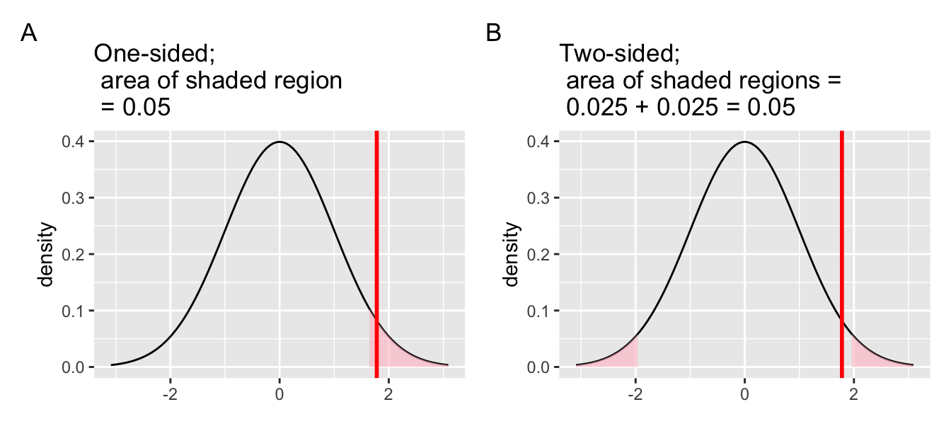
Figure 7.18: One-sided vs. two-sided test.
7.6 Conclusion
7.6.1 When inference is not needed
We’ve now walked through several different examples
of how to use the infer package to perform statistical inference:
constructing confidence intervals and conducting hypothesis tests.
For each of these examples,
we made it a point to always perform an exploratory data analysis (EDA) first;
specifically, by looking at the raw data values,
by using data visualization with ggplot2,
and by data wrangling with dplyr beforehand.
We highly encourage you to always do the same.
As a beginner to statistics,
exploratory data analysis helps you develop intuition
as to what statistical methods like confidence intervals
and hypothesis tests can tell us.
Even as a seasoned practitioner of statistics,
exploratory data analysis helps guide your statistical investigations.
In particular, is statistical inference even needed?
Let’s consider an example.
Say we’re interested in the following question:
Of all flights leaving a New York City airport,
are Hawaiian Airlines flights in the air
for longer than Alaska Airlines flights?
Furthermore, let’s assume that 2013 flights
are a representative sample of all such flights.
Then we can use the flights data frame
in the nycflights13 package
we introduced in Section 1.4 to answer our question.
Let’s filter this data frame to only include Hawaiian and Alaska Airlines
using their carrier codes HA and AS:
import::from(nycflights13, flights)
flights_sample <- flights %>%
  dp$filter(carrier %in% c("HA", "AS"))
There are two possible statistical inference methods we could use to answer such questions. First, we could construct a 95% confidence interval for the difference in population means \(\mu_{HA} - \mu_{AS}\), where \(\mu_{HA}\) is the mean air time of all Hawaiian Airlines flights and \(\mu_{AS}\) is the mean air time of all Alaska Airlines flights. We could then check if the entirety of the interval is greater than 0, suggesting that \(\mu_{HA} - \mu_{AS} > 0\), or, in other words suggesting that \(\mu_{HA} > \mu_{A S}\). Second, we could perform a hypothesis test of the null hypothesis \(H_0: \mu_{HA} - \mu_{AS} = 0\) versus the alternative hypothesis \(H_A: \mu_{HA} - \mu_{AS} > 0\).
However, let’s first construct an exploratory visualization
as we suggested earlier.
Since air_time is numerical and carrier is categorical,
a boxplot can display the relationship between these two variables,
which we display in Figure 7.19.
gg$ggplot(data = flights_sample, mapping = gg$aes(x = carrier, y = air_time)) +
  gg$geom_boxplot() +
  gg$labs(x = "Carrier", y = "Air Time")
Figure 7.19: Air time for Hawaiian and Alaska Airlines flights departing NYC in 2013.
This is what we like to call “no PhD in Statistics needed” moments. You don’t have to be an expert in statistics to know that Alaska Airlines and Hawaiian Airlines have significantly different air times. The two boxplots don’t even overlap! Constructing a confidence interval or conducting a hypothesis test would frankly not provide much more insight than Figure 7.19.
Let’s investigate why we observe such a clear cut difference
between these two airlines using data wrangling.
Let’s first group by the rows of flights_sample not only by carrier
but also by destination dest.
Subsequently, we’ll compute two summary statistics:
the number of observations using n() and the mean airtime:
flights_sample %>%
  dp$group_by(carrier, dest) %>%
  dp$summarize(n = dp$n(), mean_time = mean(air_time, na.rm = TRUE))
# A tibble: 2 x 4
# Groups: carrier [2]
carrier dest n mean_time
<chr> <chr> <int> <dbl>
1 AS SEA 714 326.
2 HA HNL 342 623.It turns out that from New York City in 2013,
Alaska only flew to SEA (Seattle) from New York City (NYC)
while Hawaiian only flew to HNL (Honolulu) from NYC.
Given the clear difference in distance from New York City to Seattle
versus New York City to Honolulu,
it is not surprising that we observe such different
(statistically significantly different, in fact) air times in flights.
This is a clear example of not needing to do anything
more than a simple exploratory data analysis using data visualization
and descriptive statistics to get an appropriate conclusion.
This is why we highly recommend you perform an exploratory data analysis
of any sample data before running statistical inference methods
like confidence intervals and hypothesis tests.
7.6.2 \(p\) hacking
On top of the many common misunderstandings about hypothesis testing and \(p\)-values we listed in Section 7.5, another unfortunate consequence of the expanded use of \(p\)-values and hypothesis testing is a phenomenon known as “p-hacking.” p-hacking is the act of “cherry-picking” only results that are “statistically significant” while dismissing those that aren’t, even if at the expense of the scientific ideas. There are lots of articles written recently about misunderstandings and the problems with \(p\)-values. We encourage you to check some of them out:
Such issues were getting so problematic that the American Statistical Association (ASA) put out a statement in 2016 titled, “The ASA Statement on Statistical Significance and \(P\)-Values,” with six principles underlying the proper use and interpretation of \(p\)-values. The ASA released this guidance on \(p\)-values to improve the conduct and interpretation of quantitative science and to inform the growing emphasis on reproducibility of science research.
Many fields still exclusively use \(p\)-values for statistical inference. As a responsible researcher, you should learn more about “p-hacking” as well and its implication for science. In Chapter @ref(), we will intentionally manipulate the data and witness \(p\)-hacking in action.
7.6.3 Additional resources
If you’d like more practice or you’re curious to see
how the infer framework applies to different scenarios,
you can find fully-worked out examples for many common hypothesis tests
and their corresponding confidence intervals in Appendix B.
We recommend that you carefully review these examples
as they also cover how the general frameworks apply
to traditional theory-based methods like the \(t\)-test
and normal-theory confidence intervals.
You’ll see there that these traditional methods are just approximations
for the computer-based methods we’ve been focusing on.
However, they also require conditions to be met for their results to be valid.
Computer-based methods using randomization, simulation, and bootstrapping
have much fewer restrictions.
Furthermore, they help develop your computational thinking,
which is one big reason they are emphasized throughout this book.
Some more stringent criterion uses 10 as the minumum, for example↩︎